
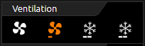
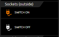
The control element Group Switch is used for switching groups, as main or central switch, scenes, step switch. Up to 4 functions can be combined in a group of switches.
However, the function behind it (this is the actual special feature) always shows only one of these symbols as active. Regardless of whether the symbols have the same group address or not.
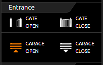
The figure on the right shows a Group Switch with two functions, one for the gate and one for the barrier. If a different group address is used for each function, it must be ensured that only the last group address triggered is displayed as active. In the normal way, such a function must ensure that only one group address or symbol may be displayed as active at a time. With the scene control element, however, this function is automatically included.
The layout for the display of the control element can be selected. The illustration above "Group switch / icons only", illustration top center "Group switch / icons and long text" and illustration bottom right "Group switch / icons and short text" show the different layouts.
A maximum of four functions including icons but without labeling can be used in one height unit. The other two layouts offer a display across two height units. One for two functions with a symbol and a long label or the other variant for four functions with a symbol and a short label. There are over 30 different symbols to choose from.
In addition to the different group addresses, the values and data types can also be freely selected.
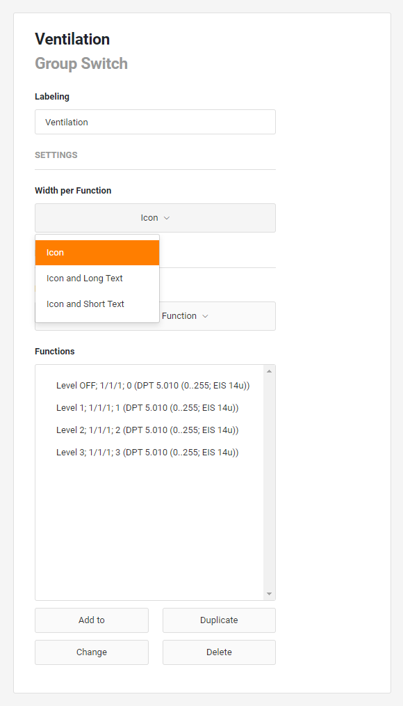
This control element has the following configuration fields (see figure on the left):
Labelling:
The label is displayed in the title bar of the element.
SETTINGS
Width per function: The width defines how many functions are displayed in one line.
Usually, a line is divided into 4 segments.
-
Icon: Each function is only one segment wide. This means that four functions fit in one line. Only the graphic is displayed.
-
Icon and short text: Each function is two segments wide. The graphic is displayed and a short description of the function can be added.
-
Icon and long text: Each function is four segments wide and thus takes up the entire line. In addition to the graphic, a longer description can be entered.
Highlights Active:
Highlighting functions can be useful, for example, for displaying the currently active light scene.
The following options are available.
-
No highlights: No highlighting for this group switch/scenes.
-
Last activated function: Only the last activated function is highlighted.
Please note that the highlighting state of a function does not necessarily correspond to the actual value at the address of a function.
Highlight equal value: A function is highlighted when the value at its address is equal to its set value. Several functions can be highlighted at the same time.
FUNCTIONS
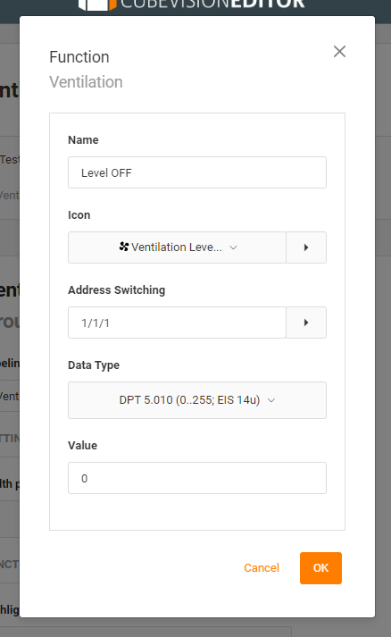
Functions: Any number of functions can be stored. With Add, Duplicate, Change, Delete a submenu opens for editing the functions.
Name:
The identifier of a function is only displayed if an option with text has been selected as "Width of functions".
Icon:
Select a suitable icon for this function.
Address Switching:
The input and output address for this function.
Data type:
The data type with which the values are sent and received. Possible data types:
-
DPT 1.001 (on/off; EIS 1)
-
DPT 5.010 (0...255; EIS 14u)
Value:
The value that is sent when the function is clicked.