
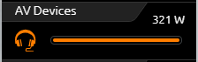
The Button control element is a simple switching element that, unlike the switch and dimming control element, does not have a dimming function. Instead, the function of the push-button can be selected. Switch, push-button and value transmitter function are available for selection. The telegram values and data types are freely selectable for the ON, OFF and push-button states.
The feedback option and value object are available in the same way as in the switching and dimming control element. This control element also has a choice of 34 different symbols.
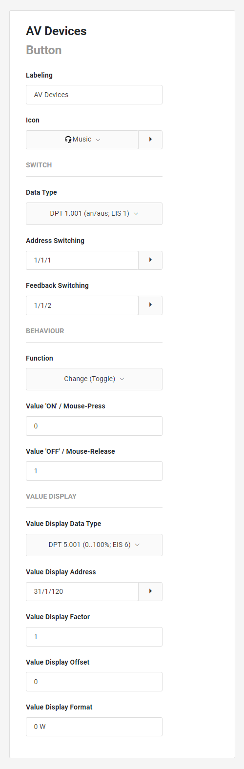
The Button control element has the following configuration fields (see figure on the left):
Labelling: The label is displayed in the title bar of the element.
Icon: Use the pull-down menu to select an icon to display for the control element. A variety of standard icons are available. Use the extension icon to obtain information on the selected icon or use your own imported icons.
SWITCH
Data type: The data type for the function of the push-button. In addition to simple ON/OFF, values from 0 to 255 can also be stored, for example to start light scenes.
-
DPT 1.001 (on/off; EIS 1),
-
DPT 5.010 (0..255; EIS 14u).
Address Switching: The switching telegrams are sent via this address.
Feedback Switching: This element can receive status changes via the feedback address. This address is optional.
BEHAVIOUR
Function: This parameter determines the behaviour of the push-button:
Change (Toggle): The push-button toggles between the two defined values with each click.
Push-button: The push-button sends the first value with a "mouse-press" event and the second value with a "mouse-release" event.
Fixed value: This button only sends the fixed value.
The following functions can be selected:
-
Push-button
-
Change (toggle)
-
Fixed value "ON
-
Fixed value "OFF
Value "ON"/ Mouse-Press: The value that is sent depending on the selected function. Depending on the data type, either 1/0 (On/Off) or 0-255.
Value "OFF"/ Mouse-Release: The value that is sent depending on the selected function. Depending on the data type, either 1/0 (On/Off) or 0-255.
VALUE DISPLAY
Value Display Data Type: This parameter determines the data type of the value input. The following data types can be selected:
-
DBT 5.001 (0...100%; EIS 6)
-
DBT 9 (670760...670760; EIS 5)
-
DBT 12.001 (4-byte signed; EIS 11s)
-
DBT 13.001 (4-byte unsigned; EIS 11u)
-
DBT 14 (4-byte floating point value; EIS 9).
Value Display Address: In addition to the normal function, the element offers the possibility to display any values. Applications are, for example, current energy consumption, operating hours, etc. This address serves as a value input.
Value Display Factor: Before the value is displayed, it is multiplied by this factor.
Value Display Offset: Before the value is displayed, it is calculated with this offset.
Value Display Format: The format can be used to define how the value is displayed:
-
"0": Fixed digit to be displayed,
-
"#": Optional digit to be displayed (usually decimal place).
-
".": Decimal separator / decimal point.
A possible format specification would be, for example. "0.0 Watt": one fixed place before the decimal point, one fixed place after the decimal point and "Watt" as text.