
It is possible to navigate through the building structure by sliding horizontally, sliding vertically and touching. Thus, intuitive operation of the visualization on the smartphone is ensured. The phone presentation is designed in such a way that so-called "one-thumb operation" is possible (depending on the screen size).
Navigation
The navigation through the building structure in the phone presentation differs from that in the tablet presentation. In order to access the visualization on different floors or in different rooms, you must touch the symbol (see figure below, orange circle).
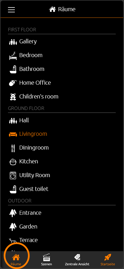
You can access the room navigation (see figure on the right-hand side).
In general, it depends on how many floors and rooms were created in the topology.
In this example, there are four "layers":
-
Central View (see chapter "Central View")
-
First Floor
-
Ground Floor
-
Outside
In order to access the required page, just touch the corresponding menu item.
Navigation within a room [room view]
If you have used the "Column Separator" element during configuration in order to categorize the elements, switch between the columns within a selected room by sliding horizontally.
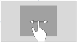
Navigation – within the columns of a room
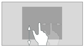
The control elements within the columns are arranged one below the other. As of a certain number of control elements, they protrude from the visible area of the screen. In order to access the required control element, sliding vertically is required.
Operating an element
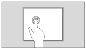
By "touching" a control element, it is activated for the respective condition. The surrounding functions are shaded in order to visually mark the selection and make it clear. Only then can the control element be operated correspondingly. In order to exit this mode, it is necessary to touch the screen outside the operable area.
Central View
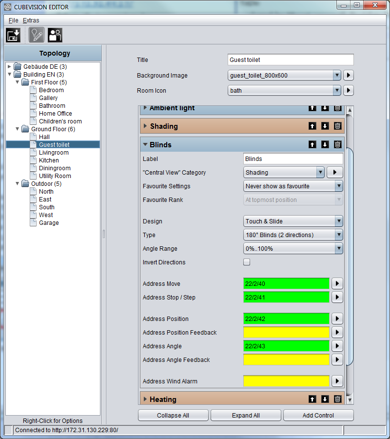
"Central View" is an additional function allows a room-independent central overview of the required functions. Each visualization element includes the "Central View" menu item and can thus be assigned the required central view.
Here, it is possible to add categories to the "Central View" menu according to your own wishes and requirements.
To do this, please proceed as described below:
-
Click the

-
A new window opens up, in which you can now create new categories.
-
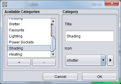
Operations (see figure below, "Add category"):
|
Symbol |
Functions |
|
"+" |
By clicking "+", a category can be added. |
|
"-" |
By clicking "-", a category can be removed. |
|
Title |
Here, the category can be assigned a title. |
|
Icon |
Here, you select a specific icon for the category. |
|
|
Click this symbol to add an individual picture for the icon. |
|
Cancel |
By clicking "Cancel", you cancel the adding process. |
|
OK |
By clicking "OK", a new category is saved. |
As soon as the control element has been assigned a required "Central View" category, the corresponding menu item is generated in a status line above CUBEVISION in the tablet presentation.
Favorites function
Upon request, the favourites function generates an automatic sorting of the control elements according to how frequently they are used (clicked). To do this, the control elements are sorted into the "Favourites" column provided in the phone presentation, whereas the respective control elements are sorted into the Instant Control Panel [ICP] in the tablet presentation.
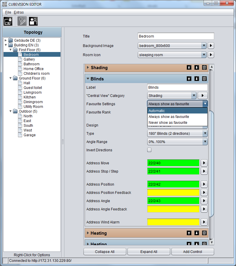
In order to ensure that a control element is considered by the favourites function, the following settings must be taken into account in the control element configuration.
|
Option |
Functions |
|
Automatic |
Here, functions are added to favourites according to the frequency of clicks. |
|
Always show as favorite |
Here, functions are always added to favourites. |
|
Never show as favorite |
Here, functions are never added to favourites. |
Column separator
With the "Column Separator" control element, the user also has the option of influencing the assignment of the control elements to the individual columns in the phone presentation.
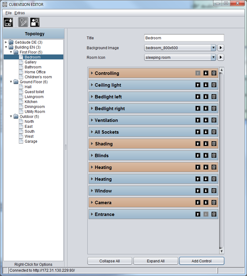
In the following example (see figure below), a "Column Separator" control element was inserted between "All Sockets" and "Blinds". Separating the columns, the "Blinds" control element is moved to the second column.
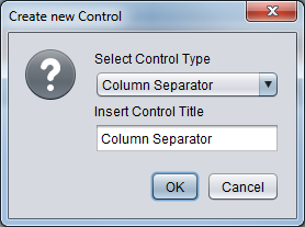
The column can be separated by clicking "Add" in the CUBEVISION Editor. The following window now opens up (see figure below, orange rectangle).
Now the "Column Separator" function can be selected; at the same time, the column separator can be assigned a title (name). This title specifies the group generated by the separation more precisely.
Example:
In the "Controlling" column separator element (see figure below, green rectangle), all control elements by means of which something can be controlled (ceiling light, ventilation etc.) have been inserted.
///