
CUBEVISION control elements
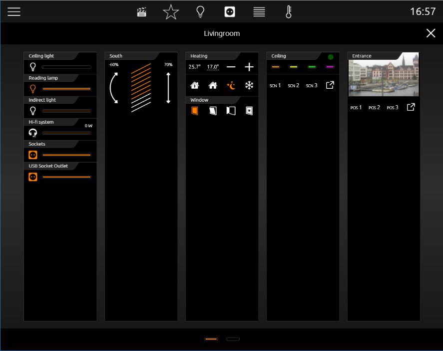
For CUBEVISION, 13 completely new (control) elements with new functions were created. The size of these control elements is stated in height units, because elements will be placed in always equal broad columns. In the tablet presentation ([ICP], [ECP]) these columns always have a height of eight (8) height units. In the "Phone" presentation view, the columns can have any height. These columns are always 8 heights unit’s high. CUBEVISION elements have a height between 1 and 8 height units. Beside this “column-view”, some elements own a second “expanded-View”. In this view, more functions and information will be displayed. “Expanded View” occupies always a complete page.
„Column–view“ will be shown in ICP and ECP and „expanded-view“ in EEV. These shortcuts have been explained in chapter 5.
Contents
Standard Options for all control Elements
Following three options exist equally in all 13 elements und will be treated at this place. Here the options:
-
Labelling. This name will be displayed in the title bar of the element (CUBEVISION).
-
“Central View” category: Here you can determine which central view category (“Central View”) the respective element is assigned to. The “Central View” menu bar is displayed above CUBEVISION (in tablet view, see chapter “Central View”) and provides central access to a group of elements. This allows you to group all light switches or all heating controls behind a central menu item, for example. The categories can be configured in a separate menu, accessible using the arrow key to the right of the selection.
-
Favourite setting. By this menu item it is defined, whether this element will be quoted in ICP as a favourite or if it will be displayed at all.
-
Automatically.
Adding this element in favourite setting. This means, that CUBEVISION defines itself the position of one element in ICP (favourite ranking) and if necessary modifies its position. The more often the element will be used, the higher it will be placed in list. -
Never showing as a favourite.
By this selection element will not be displayed in ICP, but also only in ECP. -
Always showing as a favourite.
This choice causes the deactivation of favourite ranking for this element and that the position could be defined manually. The element always will be displayed in ICP.
-
-
Favourite-Ranking
This option only will be enabled, if favourite setting „always showing as a favourite“ is selected. The option offers the choice to select which strong position the element will take place in ICP. A position value from 1 to 8 can be assigned
-
Can be operated
This parameter defines, whether the element can be operated or if it should only serve as an indicating element. In this case, this element sends out no telegram, but it will receive telegrams only.
Favourite list is 8 height units high at a max. Depending on the space, which every single element needs, not always 8 elements will fit in ICP (according to the element, 1 to 8 height units will be necessary).
Control Elements
Following the configuration and the function of all 13 control elements are explained. Here the list:
-
Column break
-
Switch/Dimmer
-
Button
-
Temperature/RTR
-
Jalousie
-
Window contact
-
RGB controlling
-
Camera
-
Multimedia
-
Weather (local KNX)
-
Weather (Internet)
-
Values / Diagrams
-
Textanzeige
-
Group switches / Scenes
-
Tuneable White
Column break
CUBEVISION control elements automatically will be inserted in ECP by the editor. So above all, the user only has a bearing on the sequence of elements.
By the help of column break, the user has the possibility to interfere additionally in the distribution of elements in the single column in ECP.
This element possesses no configuration and cannot be seen in visualization.
In following example (figure on the right), a column break element was set between the elements „wall cabinet“ and „AV consumer“. Thus the elements „AV consumer“, „socket“ and „charge station“ will be moved in the second place. (Although they would fit the first column)
It also will be possible to insert several columns breaks consecutively for putting elements to the next ECP page.
Switch/Dimmer
-
Option: Operability? Yes
-
Extended View: No
-
Height units: 1
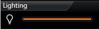
The control element switch/dimmer disposes of a switch and a dimming function (see figure right). The dimming function offers the feature sending telegrams to the bus already by „sliding“, to watch the change of lightness for example.
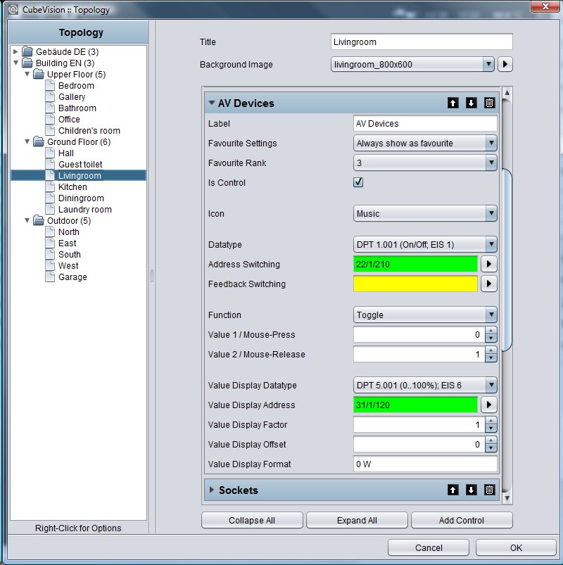
For the control element, 34 different symbols are available for selection. For giving a clear hint to the function, a combination with the symbol and a short identifier exists. Furthermore, control element offers a value object (top right in control element), to display additional information. This is useful for example to keep one eye always on the actual dimming value, operating hours or power consumption of this participant.
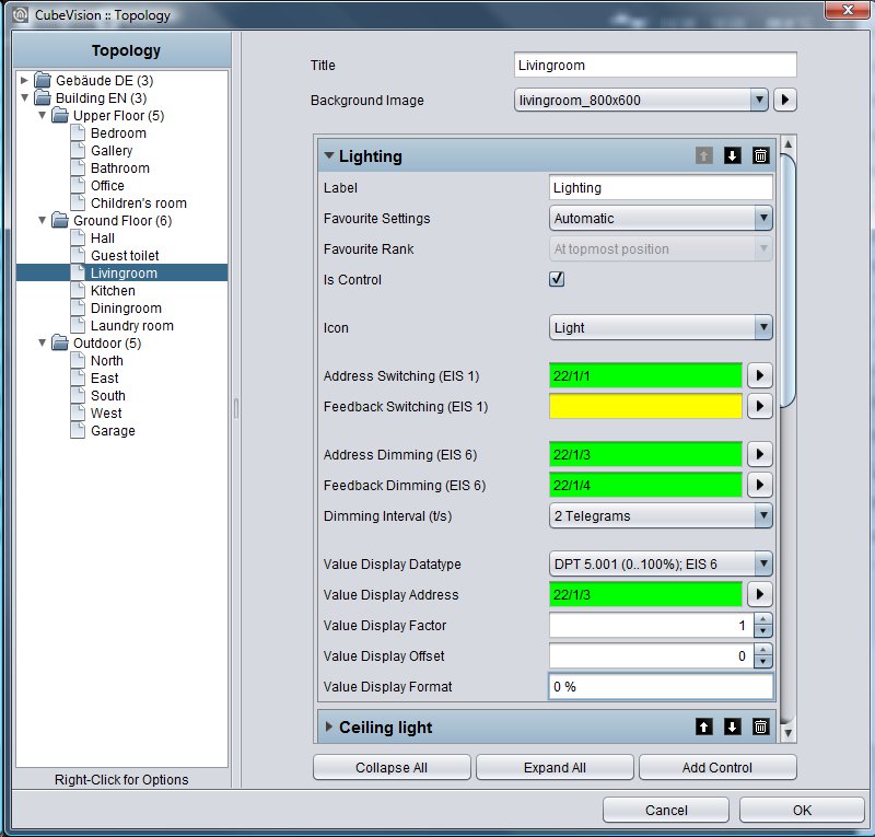
Following configuration fields this control element possesses (Identifier see figure below):
-
Icons. These 34 symbols are located on the left side and can display one active or inactive state (see figure, left).
-
Address switching (EIS1). Therewith the group address is meant, on which the EIS1 telegram will be sent. By activating, the digit “1” and by breaking, the digit “0” will be transmitted.
-
Feedback switching (EIS1). To the function “switching”, a separate feedback address can be applied. Then the symbol and the bar are showing the registered state.
-
Address Dimming (EIS6). The group address of the function “dimming“ supports absolute dimming (data type EIS6, value range 0-255). To modify the dimming value, bar (slider) will be used, thereto you can slide on the bar with mouse or finger, from left to right. The left side of the bar represents the dimming value „0“ and the right side the value „255“. The orange circle indicates a) that it is about a dimmer and b) the position of the slider (actual state of dimming).
-
Feedback Dimming (EIS6). This is the separate feedback object for the dimming function. Received state of dimming will be displayed proportionally. In case a group address was specified, value “Address dimming” has no influence to the bar graph (see also TIPPS, item 4).
-
Dimming Interval (T/s). Enables periodic sending with up to 4 telegrams per second. This means, while the dimming state is altering, telegrams will be sent just in time. This function can be disabled to reduce the bus load. In this case, dimming level will be sent only then, when the slide will be released.
-
Value display data type. For value display, data type of the group address will be selected at this point. For selection are available EIS5, EIS6 and EIS9.
-
Value display address. The value of a group address is shown in the value display (see for example figure top right). This example displays the actual dimming value as a value object).
-
Value display format. Here the display format will be defined, which includes the unit, the pre- or post-decimal place of the value object (see TIPPS item 6).
TIPPS:
-
The control element of a dimmer or a switch can be distinguished by an orange circle in the bar. If a circle is seen there, it is about a dimming control element and if the circle is absenting in the bar, it is about a pure switch.
-
In a switching control element, the complete area of the control element reacts as a switching button.
-
A combined switching and dimming control element will be switched by a short typing on the complete surface. Dimming takes place by moving the circle of the bar, starting with the actual position. A longer hitting to an arbitrary position in the bar causes “jumping” at this dimming value. As long as the bar doesn`t be released, dimming value can be changed.
-
If to the feedback objects no group addresses were assigned, so the values of switching and dimming group addresses will be displayed in a feedback state.
-
While dimming, the value object will be blinded out and the actual dimming value appears. After dimming, dimming value will be blinded out and the value object comes out again.
-
Formatting of the value display. The digit „o“ implies a fixed digit and will be displayed always. “#” is one optional digit (as it will usually use as a post-decimal digit) and it will be displayed only if it is necessary. The “.“ stands for a decimal separator. After that formatting, you still can append the unit.
For example: 00.0 watt will always be shown with two digits before the decimal separator und one digit after it. The letters “watt” will appear after the displayed value and will serve as the value`s unit.
Pushbutton
-
Option: Operability? Yes
-
Extended View: No
-
Height digits: 1
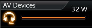
This control element is a pure switching control element, without a dimming function. But on the other hand, you can select the function of the pushbutton. At choice there are switch, pushbutton and a value sending function. Telegram values and data types are selectable freely. The options feedback and value object are available for the states “ON”, “OFF” and “button free selectable”. The options feedback and value object are similarly available, as in the switching and dimming control element. Also, for these elements different symbols are selectable, too (here they are 34)
This control element has got following configuration fields (identifier see figure below).
-
Icons. These 34 symbols are located on the left side and can display one active or inactive state (see figure, left).
-
Data type. For switching function, data type of the value, which has to be sent, will be selected at this place. At choice, there are EIS1 (0,1) and EIS14 (0-255).
-
Address switching (EIS1 or EIS14). Group address, on which the switching telegram will be sent.
-
Feedback switching (EIS1 or EIS14). A separate feedback, which displays the actual state of the control element. The symbol and the bar show the confirmed state.
-
Function. Hereby it is determined what will happen, if the pushbutton is actuated. Here the options:
-
Changing (Toggeln). Every push of a button changes the state between ON and OFF and will hold it. Only a telegram will be sent. Exception, values can be assigned freely for every state (also not only “0“ or “1“ are possible).
-
Pushbutton. Actuating this button, two telegrams will be sent. The first telegram by pushing the button (for example ON) and the second by releasing the button (for example OFF). Here also values for ON and OFF can be assigned and inverted freely.
-
Value Sender. A freely selectable value can be chosen, which has to be sent by actuating the pushbutton.
-
-
Value „ON“/mouse-pushing and value „OFF“/mouse-releasing. These two fields define values, which will be sent by ON or OFF. They are freely selectable.
-
Value display of data type. For the value display, data type of the value will be displayed and selected here. For selection are available EIS5, EIS6 and EIS9.
-
Value display of address. Value of this group address is shown in the value display (see for example figure on the right. This control element displays the actual power). Data type of this group address will be selected in field value display data type.
-
Value display of format. Defines the display format. In other words, the unit, the pre- and the post- decimal places can be specified.
Formatting of value display. The digit “o“ implies a fixed digit and will be displayed always. “#” is one optional digit (as it will usually use as a post-decimal digit) and it will be displayed only if it is necessary. The “.“ stands for a decimal separator. After that formatting, you still can append the unit. For example: “00.0 watt” will always be shown with two digits before the decimal separator und one digit after it. The letters “watt” will appear after the displayed value and will serve as the value`s unit.
Temperature/RTR
-
Option: Operability? Yes
-
Extended view: No
-
Height digits: 1 or 2
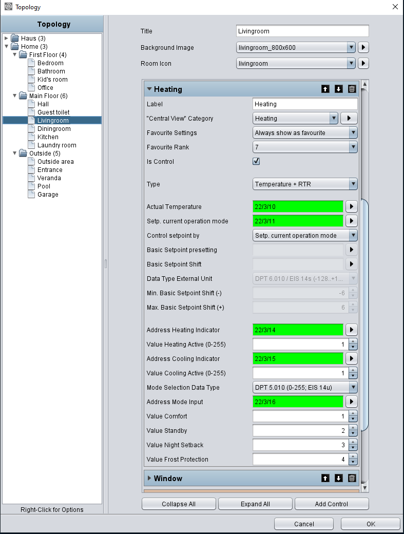
Temperature/RTR control element undertakes the control of the heating in CUBEVISION control element. So, this control element offers the opportunity to display the actual value of temperature, the operating mode and to set the nominal temperature value or the mode of operation. The two temperature values, which will be shown in the first line (see figures), display on the left side the actual temperature and on the right side a nominal value.
Nominal value can be adjusted by a PLUS and MINUS symbol. If this control element will be configured as a substation, the base nominal value will be modified by PLUS and MINUS symbols. In addition, the actual temperature value indicates also, if just heating or cooling is working.
Both states differ from each other by colour orange and blue. Blue means cooling and orange signifies heating. If temperature will be displayed in white, neither of both modes is enabled or the display was not configured before.
Another feature is the control of operation modes. These are comfort, standby, night reduction and frost protection. Switching can take place optionally by three group addresses or by one group address with four different values
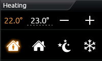
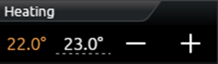
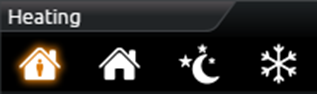
For this control element three different views are for selection:
-
Temperature und RTR display
-
Temperature Display and
-
RTR Display
This element has got following configuration fields (identifier see figure below).
-
Type. This choice defines the control element `s view. For selection are temperature and RTR, only temperature and only RTR (only the symbols of operation modes).
-
Address of actual temperature (EIS5). Group address of a temperature sensor for actual temperature.
-
Address setpoint current operation mode (EIS5). Group address for the actual temperature. If the control element isn`t configured as a substation, adjusted nominal temperature will be displayed on this group address. In this case, the modified nominal temperature (with PLUS and MINUS) will also be sent on this address. But if the control element is configured as a substation, only the NOMINAL temperature will be shown.
-
Control setpoint by. The address of the RTR via the setpoint temperature is to be set. Your selection in which way the setpoint temperature can be controlled:
-
Setpoint current operation mode
-
Basic setpoint presetting
-
Basic setpoint shift
-
-
Basic Setpoint presetting. The input field is active if selected in previous menu item and it is address for setting the basic setpoint.
-
Basic Setpoint Shift. The input filed is active if selected in previous menu item and this is input address for the basic setpoint shift temperature. The datatype is DPT 6.010 (EIS14).
-
Data Type External Unit. Usually the external unit changes the „Basic Setpoint Shift“ value with an DPT 6.010 value (-128, +127) multiplied with a configured step width. If the setpoint is changed in a different way (e.g. directly using the basic setpoint temperature), the data type DPT 9.001 (EIS5) can be selected here.
-
Min and Max basic set point adjustment (-/+). This value defines the maximal negative resp. positive basis set point adjustment. In case you fill in here a value of +/-6 for example and the configured step range is 0.5°C, so a possible set point adjustment from up to +/-3°C is the result of.
-
Address Heating Display (EIS14u). In order that the actual temperature is able to display the state of heating (value is coloured in orange), the group address of RTR will be filled in here, on which RTR will sent, when RTR switches to the state of heating.
-
Value heating active (0-255). At this place, the value will be defined, which will be sent by the group address heating display, if this state was activated. Possible values are 0-255.
-
Address Cooling Display (EIS14u). In order that the actual temperature is able to display the state of cooling (value is coloured in blue), the group address of RTR will be filled in here, on which RTR will sent, if RTR switches to this state of cooling.
-
Value cooling active (0-255). At this place, the value will be defined, which will be sent by the group address cooling display, if this state was activated. Possible values are 0-255.
-
Data type operation mode (EIS1 und EIS14u). Das RTR/Temperature control element offers the possibility to control operation mode in two different ways:
-
Over EIS1. In this setting, the configuration window displays three (EIS1) group addresses, each for comfort/standby, night reduction and frost protection. If also a “1” will be received on the group address Comfort/standby, the control element will highlight the symbol comfort, in case of a “0”, the symbol standby will show as active. Operation modes night reduction and frost protection will be displayed each other as active by receiving a “1”. Only one symbol can be highlighted or displayed as active.
-
Over EIS14u. At this choice, the configuration window displays a field for the group address address mode input and in addition four lines, in which the values of the operation modes comfort, standby, night reduction and frost protection will be defined. The value range of these fields extends from 0 to 255. In figure, switching of operation mode by EIS14u is configured. If the user switches to the mode comfort for example, the control element will send the value “1” to the group address 22/3/16. The other way round, if the control element receives value “2” on the group address, the RTR display will switch to standby.
-
Jalousie
-
Option: Operability? Yes
-
Extended view: No
-
Height units: 3
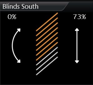
Shadowing will be controlled by the control element jalousie. The control element shows graphically the vertical position und the angel of the jalousie.
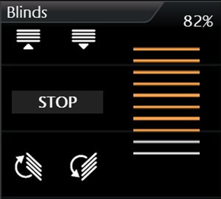
In addition to the graphical display, positions will be shown as values. These values are displayed in percentage terms for position (right value) and angel (left value) of the jalousie. In figures two types of jalousie control element are illustrated. The control of these control elements takes place in two ways:
-
Standard (for push-button)
-
Touch & Slide (for sliding)
As its name implies, you can use in type „standard“ a button and in type „touch & slide” a slider. Figure shows how to control the control element by “touch & slide” and figure right displays the controlling of “standard”
In mode „touch & slide“, you will simply position your finger on the left side to the angel control or on the right side to the position of jalousie and then you move the finger in the desired direction. While moving the finger, you get an optical feedback over the angel or the position of the jalousie. If the desired position will be reached, jalousie will approach to it, just as you will release the control element.
Three different modes of shadowing can be controlled:
-
Jalousie. Classical jalousie with lamellae, which can be inclined in both directions.
-
Roller blind. It can only be moved high and low.
-
External blind (venetian blind). Similar to the classical jalousie, but with the different, that the lamellae can be inclined in only in one direction out of its horizontal position.
Depending on selected types of jalousie, element displays only these controls, which are required actually. So, it will be displayed no button or no arrow for adjustment of an angel in the element type roller blind. Also, this element possesses feedback objects. In this element, they are position and angel (which can be enabled or disabled according to the type of shadowing). Also, one input for wind alarm is available of course.
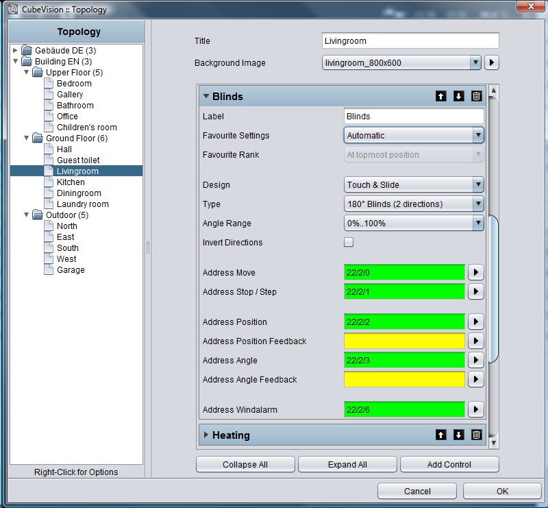
This control element has got following configuration fields (identifier see figure below):
-
Display. This choice defines the type of control unit for the jalousie control element. You can choose between a typical control and an intuitive gesture control (touch and slide). While a typical control displays buttons, the touch & slide control depicts two arrows. The different to the typical control is the fact, that the desired position can be defined as well as by tapping directly or by sliding with the finger from an arbitrary position to the desired position. Furthermore, positive is the effect, that the position, which will be approached after releasing, at the same time will be displayed in the control element, also a kind of preview.
-
Type. This control element optionally can be predefined to the three different types of jalousie, which were explained detailed in previous chapter.
-
Angel area. This feature was implemented to fit the angel area according to the type of jalousie. This is necessary, so that the angel can be displayed correctly in visualization. Depending on the manufacturer, the angel will be specified in 0-100% from left-hand or right-hand hinge of lamellae. Also, the alternative (-100% to +100%) exists, in which the value 0% describes the horizontal lamellae position.
-
Direction inverting. For the reason, that the direction of the jalousie will be interpreted differently again and again, movement direction of the jalousie can be defined by this option. With this option can be selected, whether jalousie will be run up by “1” or “0.
-
Address Move (EIS7). This group address controls the "raising and lowering" of the blinds.
-
Address stop/step (EIS7). This group address sends the order for stop or step.
-
Address position (EIS6). One desired position of the jalousie can also be approached directly by an entered value (0-255). If the user touches the middle of the right arrow (touch & slide type) for example, to this group address the value 127 will be sent, and thereby the jalousie automatically moves to this value (position). If in field feedback position no group address was entered, jalousie control element uses this value for displaying the position of the control element.
-
Address angle (EIS6). The desired angle of the slat can also be set directly here using a value (0-255). If the user touches the center of the left arrow (on the touch & slide type), for example, the value 127 is sent to this group address, causing the slats to move to this angle.
If there is no group address in the Position Feedback field, the blind control element uses this value to display the angle of the slat. -
Address feedback position (EIS6). If in this field a group address is filled in, so the control element doesn`t show the position, which was adjusted by address position, but it will display the actual position, which this group address will receive.
-
Address feedback angel (EIS6). If in this field a group address is entered, the control element doesn`t show the angel, which was sent over address angel, but the value of the angel, which this group address will receive.
-
Address wind alarm (EIS1). In jalousie control element, an optical message for wind alarm will be displayed, if this group address will receive value „1“. So, the jalousie will block and the controlling of the jalousie will not be possible anymore, as far as value “1” is applied to this group address.
Window contact
-
Option: Operability No
-
Extended view: No
-
Height units: 1
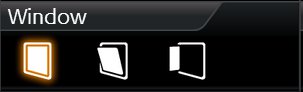
To illustrate the state of windows, control element window contact is used. It shows following positions resp. states:
-
Closed
-
Open
-
Tilted
-
Glass breakage
Every position und the glass breakage have got its own symbol, which can be displayed in the control element. If one position is activated, corresponding symbol will be highlighted in orange. In case no group address was applied for a position or a state, corresponding symbol will not be shown.
The position of the window can be displayed by two different data types. There are data of type EIS14 (0-255) and EIS1 (o or 1). The different between both data types is the number of group addresses. This means, that in data type EIS 1 the position by the group address and in data type EIS14 the position by values have to be defined. Furthermore, this control element can announce glass breakage. Independent from the data type, this control element always has its own group address.
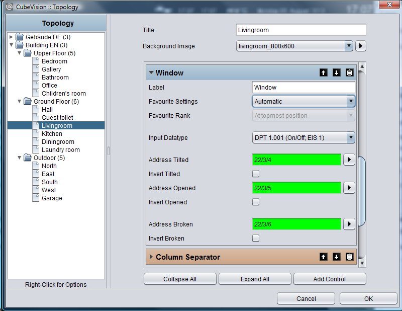
This control element has got following configuration fields (identifier see figure below):
-
Data type input. You can select, which position of the window will be evaluated. The functionality of both types was explained in previous chapter.
-
Data type EIS14.
-
Address position. By this one group address, the window position will be received.
-
Values closed/tilted/open. These three values define, when the positions closed, tilted, and open are activated in visualization. These values can be assigned freely.
-
-
Data typ1 EIS1.
-
Address tilted. By this group address the state of the position “tilted” / “closed” will be received. In case of value „1“, the symbol of the titled and closed windows with Value “0” will be highlighted.
-
„Titled“ inverted. But if the window contact announces position „titled“ with the value „0“, this option can invert the evaluation.
-
Address open. On this group address, the received value „1“ for the position „open“ will be shown in visualization.
-
„Open“ inverted. Just as in field titled inverted, evaluation can be inverted here also.
-
By the way: This type has got no group address for the window position “closed”. This position will be shown, if the group addresses (open, titled) have got the value “0”.
-
Address glass breakage. Address of glass breakage. If a glass breakage sensor exists, so an optical warning of glass breakage can be displayed by this address. Value „1“ signifies glass breakage and '0' stands for no glass damage.
-
Glass breakage inverting. Also, here, evaluation can be inverted, so that value „0“will be interpreted as a glass breakage.
RGB Control
-
Option: Operability? No
-
Extended View: Yes
-
Height units: 2
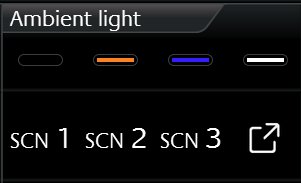
Of course, a control of RGB lighting must not be absent in CUBEVISION control element. The control element RGB control undertakes this task. The possibilities are given to call up light scenes and predefined colours and to blend colours over visualization freely.
This control element has got to views: A compact one with two height units for the ICP, resp. for the ECP and another one in EEV. The compact view shows 4 freely selectable colours at a max in the first line and maximal 3 buttons for scenes in the second line.
The second view shows the RGB control element in EEV with more possibilities of operation. Beside the choice of colours and light scenes, EEV will uses also colour channels (up to four RGBW) and a colour circle. Figure displays the RGB control element in EEV view. In the right column, the slider is situated, by which the single DMX channel can be controlled.
By the way, if no group address is entered for the channel “white”, this channel will not be displayed in visualization. In the center of this view, the colour circle is located, by which colours are chosen by fingertip. Just below, 2 lines with each 4 buttons of predefined colours and light scenes are situated. In the line of the light scenes, an additional reserved button is located to stop the running light scene.
To send a colour value to a RGB lamp, different methods exist, depending on the lamp`s type. They differ either in having one group address for all colour values or in offering a separate group address for every colour value. Data types:
-
4x1byte values (one object for each R, G, B und W; EIS6; 0-255; for the most applications)
-
1x 4byte value (one object for each R, G, B und W; similar to DTP232.600 plus an extra channel for white)
-
1x 3byte value (one object for R, G und B; DPT 232.600)
In order that, the possibility exists finding out the correct control mode for nearly every RGB lamp type. Configuration of light scenes consists simply in allocation of the group addresses. If the group address for a light scene is absent, so this address will not be displayed in Cube. If one of the light scenes will be released, EIBPORT transmits to this group address “1”. By a click once more to an active/running light scene, EIBPORT sends the value “0” to this group address. In RGB control element, there is a place for 4 light scenes at a max. The lettering of the light scenes are “Scene 1” up to “scene 4” and can`t be modified.
Just right to the light scenes, the button “scene blocking” is located. This button is a light scene as well and will be reserved in case, a scene will not be desired at all and a simple stop of the light scene will not be enough. Therefore, a separate light scene can be arranged, which dims down the RGB lamps as long as they are turned off or they have changed to a selected colour.
In addition to the four buttons for the light scenes, another four buttons of the favourite colours exist. For configuration of the colours, it is only necessary to select the desired colour by the colour selection dialogue.
Also, there is no handling with colour values needful. CUBEVISION editor uses this colour out of the colour selection dialogue of visualization. The colour values come from the colour selection dialogue and the group addresses of colour values from the RGB control element.
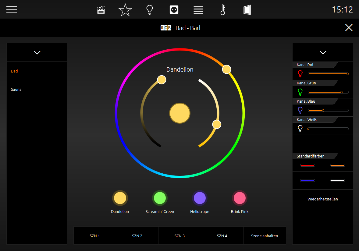
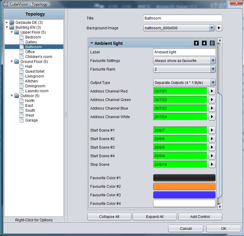
This control element has got following configuration fields (identifier see figure below):
-
Output type. Types differ from, if all colour values (red, green, blue and white) will be sent to a single group address or if every colour value should be sent with a separate group address. Thereby it is about a 1 byte data type with a value range of 0-255 resp. 0-100%. The chapter before explains these data types.
-
Address channel red, green, blue and white. At data type 4x1byte, configuration mask shows four fields for group addresses. These fields are labelled with the respective channel colour. In case another data type will be used, configuration mask displays accordingly only one field for a group address. These group addresses are used also in the colour circle (in EEV) and for the favourite colours.
-
Scene starting #1 … #4. Light scenes will be started by this field with value „1“ and will be blocked with value „0“.
-
Scene blocking. Also, a scene button, that is reserved for a light scene, which will be activated if a running scene will not be desired anymore or a lighting has to be shut off. This button works exactly as the other scene buttons, but it is only labelled with “scene blocking” in contrast to the others.
-
Favourite colour #1 … #4. Opens a colour selection, in which desired colour can be chosen. CUBEVISION editor cares for colour value, group address und colour fields.
In addition to the favorite colors that can be set in the CUBEVISION Editor and are binding for all clients, you can set additional favorite colors for each client separately in the highlighted area.
RGB control in the phone presentation
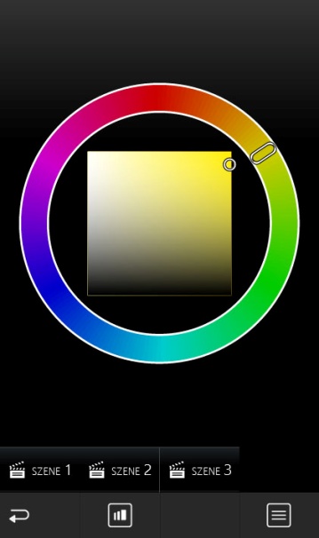
The extended element view ([EEV]) of the RGB control has a different structure in the phone presentation of the CUBEVISION due to the optimization on smaller displays.
EEV view 1
If the control element is opened in the extended element view ([EEV]), only the colour circle and the scene control are displayed at first.
EEV view 2 
In order to display the individual channel control and the default colour settings instead of the colour circle, it is possible to switch between the different views using the "View" symbol.
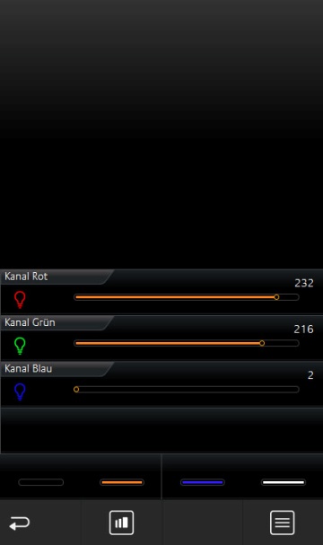
List view 
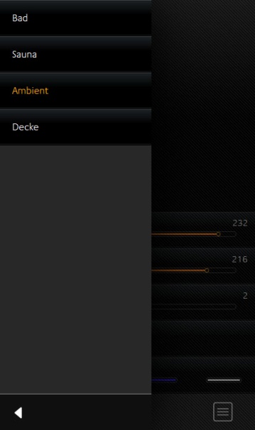
Touching the "List" symbol displays a list with all RGB controls created in the room. In this way, further control element can be accessed without having to navigate through the rooms in a time-consuming manner.
Camera
-
Option: Operability? No
-
Extended view: Yes
-
Height units: 3
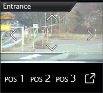
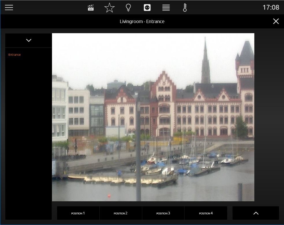
The camera control element also has got two kinds of views. A small camera view (preview), with a small choice of functions for ICP and ECP (see figure). EEV displays the second view, in which additional options and functions are situated, beside a larger display of camera view. To the functions of the smaller camera view belong Pan, tilt control and three fixed positions, which can be activated. The movements can be controlled directly by the arrow symbols in the camera picture itself. Just below the camera picture, three position buttons are situated, to call up confirmed positions. In the view of EEV however, there is space for a fourth button, for a zoom function and for the possibility, to switch between the formats motion JPEG and static JPEG. (see figure).
The configuration will be very simple. Start will be the “base URL”, which typically consists of the IP-camera`s address and if necessary, of the http-port. After that, paths to the JPEG camera pictures (motion and static), positions and PTZ orders will be filled in. Here it is about a so called http-request. These will be composed on demand out of the basis URL and the corresponding path.
Example: In case arrow symbol „left“ will be released in visualization, visualization assembles basis URL and path of action „left“ to a http-request and transmits it.
A configuration of http-request control is optional. If paths of functions will be left off, the control element also will not display these in visualization. As a feature, camera control element offers the possibility to display the three different display formats 4:3, 16:9 and 16:10.
This control element has got following configuration fields (identifier see figure below):
-
Basis URL. This URL is the basis and it always will be written in front of the paths of PTZ-control or camera picture. As a rule:
http://<IP-address or DDNS names>:<http-port>
-
Aspect ratio of picture. In order that, the aspect ratio of the picture can be adapted to the camera. Formats 4:3, 16:9 and 16:10 can be selected
-
Path motion JPEG. In this field, a direct path to stream will be filled in. This pattern of display is very fluent in a simultaneous quality, but it also needs more resources.
-
Path JPEG Image. Nearly all IP-cameras possess a path to a static picture. It is about the picture, which the camera records in the moment of calling. In case this path will be used for visualization, it attempts to call up the picture several times, so that a motion picture will be created.
-
Path zoom in/out. These fields are connected with the plus and minus symbols in the camera view. Paths contain the orders for scaling down and for scaling up the camera picture.
-
Path movement up/down/left/right. These fields are connected with the arrow symbols in camera view. The paths contain the orders for the left, right, up and down movement of the camera picture.
-
Path position #1 to #4. Paths for configured and stored positions of the camera.
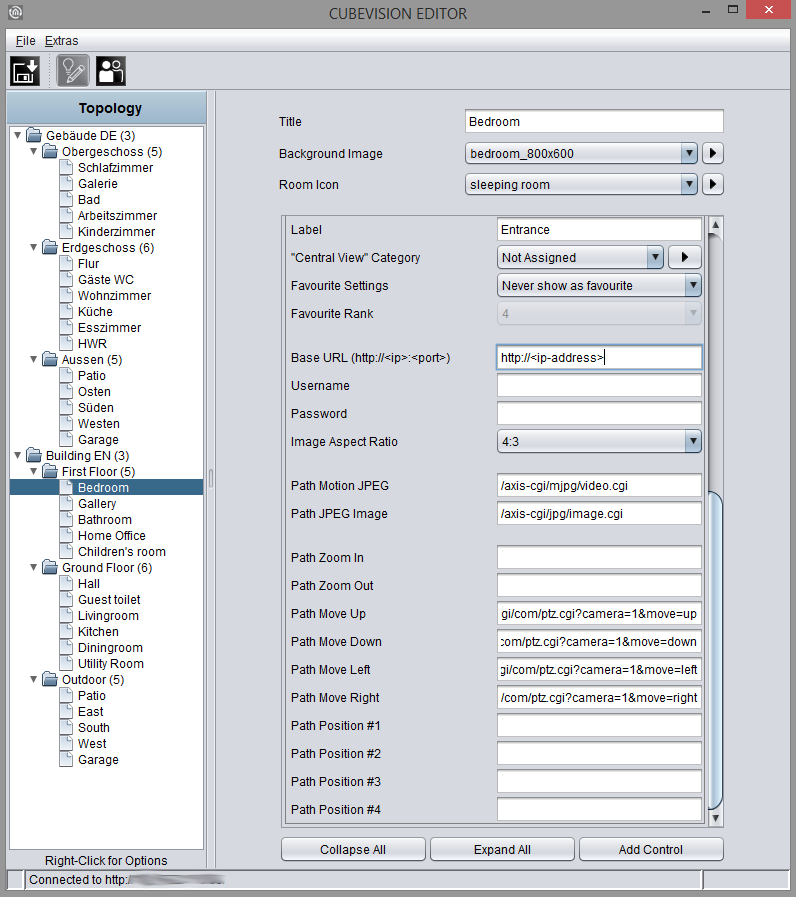
Path for configuration fields 3 to 7 may not contain basis URL. Basis URL will be completed by CUBEVISION.
Camera control in the phone presentation
The extended element view ([EEV]) of the camera control has a different structure in the phone presentation of the CUBEVISION due to the optimization on smaller displays.
EEV (Extended Element View)
The camera control element has a simplified view in the EEV of the phone presentation. It consists of the camera picture including the (optional) control elements and the position keys.
Support for Axis camera
Load default values:
This function automatically fills in the paths for an Axis camera. For cameras from other manufacturers, please contact the manufacturer of the camera to find out the paths for your camera.
Multimedia
-
Option: Operability? No
-
Extended view: Yes
-
Height units: 3
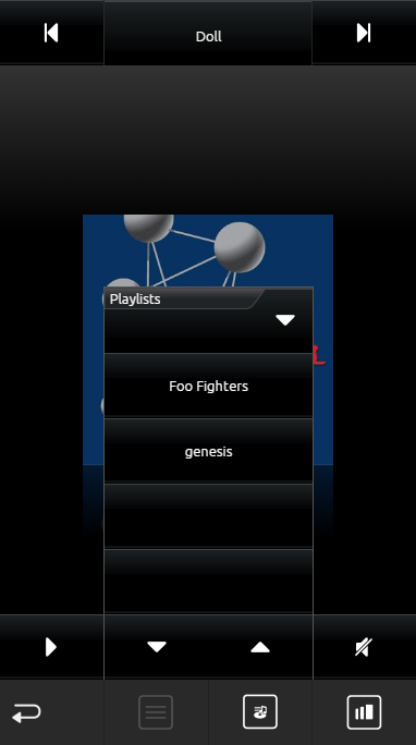
Of course, multimedia control is also a must in CUBEVISION. The ICP and ECP views include the functions “Volume up/down,” “Mute,” “Playlist forward/back,” and “Play/Pause.” Music information is displayed in the first line. See illustration.
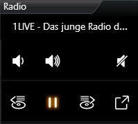
When the EEV is opened for this control element, a cover and a dynamic playlist selection are also displayed. The playlist appears when you click on the cover. AUDIOMODULE (“Squeezebox Controller”) and UPnP-compatible devices are supported as multimedia clients.
As soon as these devices are available on the network, they can be selected for linking in the configuration.
If you want to use a different multimedia client, you can also configure it manually. A separate field for a group address is displayed for each multimedia function (pause/play, volume up/down, etc.).
In addition to the control options, the multimedia control element also displays information. This includes the artist, album, title, and cover (if the music information is available).
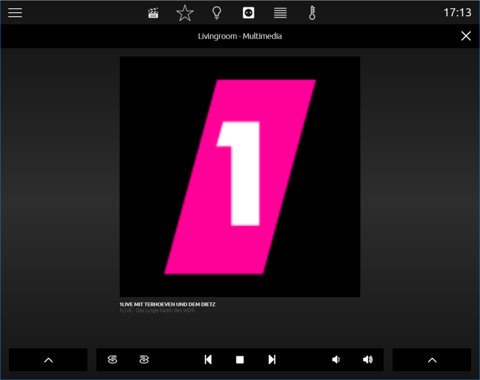
A click on the cover display opens the playlist menu. This is closed again with a further click next to the cover.
This control element has got following configuration fields (identifier see figure below):
System.
What kind of type should be controlled by multimedia? For selection are:
-
Manual configuration
-
UPnP and
-
SqueezeboxManual configuration
Manual Configuration
If this choice is selected for the system, the control element displays a list of group address fields (see figure). This precept will be used for controlling different media (RS232, http-request, infrared, group addresses etc.) for example. This control element has the following configuration fields (see figure below):
-
Play/Pause. EIS1 group address
-
Playlist forth/back. EIS1 group address
-
Track forth/back. EIS1 group address
-
Loudness gradually. EIS1 group address
-
Silent. EIS1 group address
-
Info track. EIS15 group address
-
Info interpreter. EIS15 group address
-
Info album. EIS15 group address
-
Cover URL. Path to actual cover
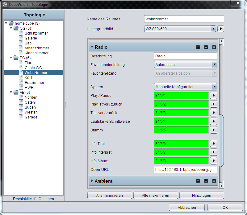
UPnP
If UPnP is selected as the system, UPnP-compatible devices can be controlled via the multimedia control element. Under the “System” selection, the menu item “Select UPnP device” appears, which can be used to select the device to be controlled.
Squeezebox Controller
In order to control a Squeezebox or an AUDIOMODULE using the multimedia control element, "Squeezebox Controller" must be selected in the "System" menu. After the selection has been made, the "Select Squeezebox" button displaying the Squeezebox devices and AUDIOMODULE available for linkage in the network appears. Select the required device and confirm the dialog with "OK".
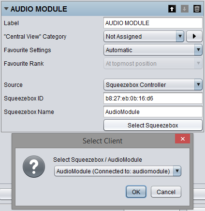
Requirements for the control of Squeezebox players and the AUDIO MODULE
Please note that at least one Squeezebox player instance and a Logitech Media Server with xPL Hub and ExPL Plugin must be available in the network in order to control Squeezebox players and the AUDIOMODULE. For further information, please refer to the AUDIOMODULE documentation.
Multimedia control in the phone presentation
The extended element view of the multimedia control element in the phone presentation of CUBEVISION differs from that in the tablet presentation.
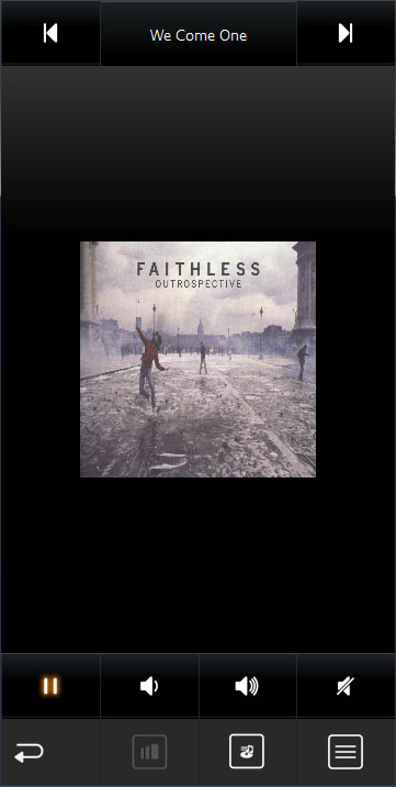
EEV view 1
In the first layer of the phone EEV view, the Cover Art and the "Play/Pause", "Volume Up/Down", "Mute" (bottom) and "Next Title/Previous Title", "Title" (top) control elements are shown.
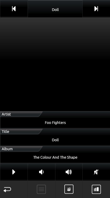
EEV view 2 
Use the "View" symbol to switch to the second layer of the EEV. In the second layer of the phone EEV view, additional information such as "Artist", "Title" and "Album" is displayed.
Playlist selection 
A playlist selection is called using the "Playlist" symbol. If a SONOS device has been linked to the multimedia control element, the radio stations linked in the "Sonos (UPnP) Configuration" can be chosen here (see above or in chapter "Extras"). If an AUDIOMODULE or a Squeezebox has been linked, the playlists created in the Logitech Media Server are available here.
Weather (lokal KNX)
-
Option: Operability? No
-
Extended view: No
-
Height units: max. 5
This is an control element for simply showing measured data of the home weather station, in the CUBEVISION. The element standardly displays (across the complete width of the control element) the outdoor temperature in the first line. Following lines are divided in two columns. Every field shows beside of the measured value, an identifier, the unit of the measured value and a suitable symbol. (see figure).
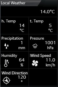
Beside the temperature indicator, following measured values are applied with symbols: These are:
-
Wind speed and direction
-
Brightness
-
Air pressure and humidity
-
Precipitation
If the desired type will not be displayed, the seventh type is ready, which can be used universally. The only difference to the other types is, that this type displays no symbol in visualization. In figure for example, both values in the second line (h.temp and t.temp) are created by the universal type.
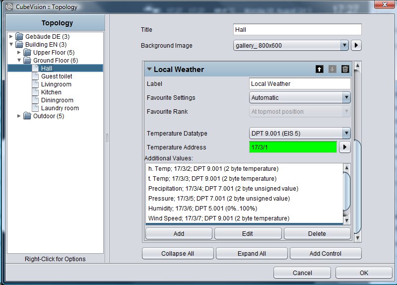
This control element has got following configuration fields (identifier see figure below):
-
Temperature Data type. For temperature value, data types EIS5 and EIS9 are selectable.
-
Temperature Address. This group address is designated for outdoor temperature. The value will be displayed in the first line of the control element.
-
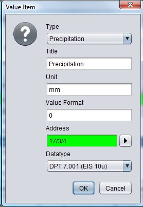
Append/modify/delete. By these buttons, additional measured values can be appended, deleted or modified. If deleting, marked values of the list will be erased. By appending and modifying, another configuration window will open (see figure), in which new measured values can be applied or existing values could be modified. Options:
-
Type. For weather control element, the six most usual measure values are deposited with a symbol. These are the types: wind speed, wind direction, brightness, air pressure, humidity, precipitation and the universal value. If one of the types will be selected, following the two fields “name” and “unit” will be filled in automatically. But these entries can be modified afterwards.
-
Name. Identifier for this measured value, which are placed in CUBEVISION below the measured value
-
Unit. The unit, which will be entered here, will be shown in CUBEVISION under the measured value.
-
Value format. In this field, the formatting of the measured values takes place. The Pre- and post decimal places of the value object can be defined as follows. A “0” means a fixed digit and will be displayed always. A ”#” is one optional digit (as it is used commonly for post-decimal places) and only will be displayed on demand. The “.” signifies the decimal point.
-
Address. The real group address of the measured value.
-
Data type. For value display, at this place data type will be selected, which has to be shown. For selection are DTP1.002, DTP5.001, DTP5.010, DTP7.001, DTP9.001 and DTP 14.
-
Weather (Internet)
-
Option: Operability No
-
Extended view: Yes
-
Height units: 2
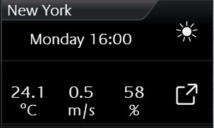
If there is no local weather station or weather data should be displayed from a certain place, CUBEVISION is able to download weather data out of the internet. The control element has got two types of a view. In view for ICP and ECP, actual time, day of the week, actual temperature, actual wind speed, rain probability and an icon, which shows the actual weather conditions (see figure).
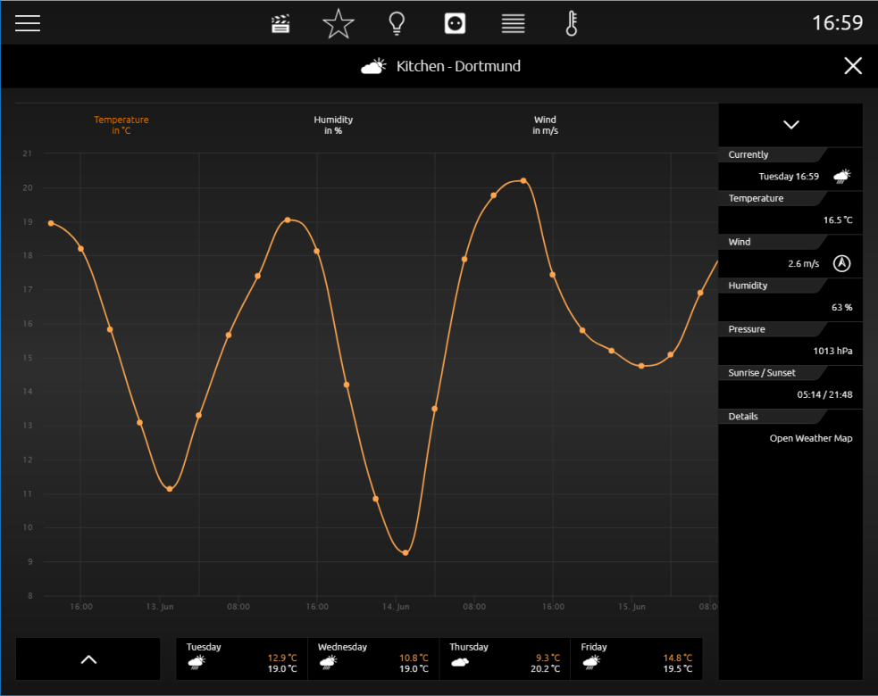
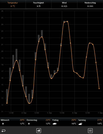
In the second view, additional to the stated data, air pressure, time, time of sunrise and sunset, a four days weather forecast (incl. lowest and highest temperature) and four diagrams (illustrating temperature [incl. highest and lowest temperature], humidity, wind speed and precipitation) will be displayed (see figure).
Accurate values will be shown by “tracing” the diagram with finger or mouse. The values will be displayed in a kind of a speech ballon.
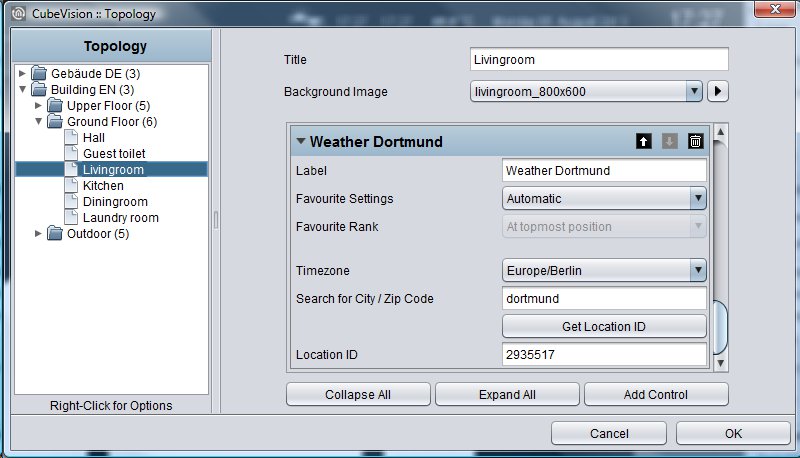
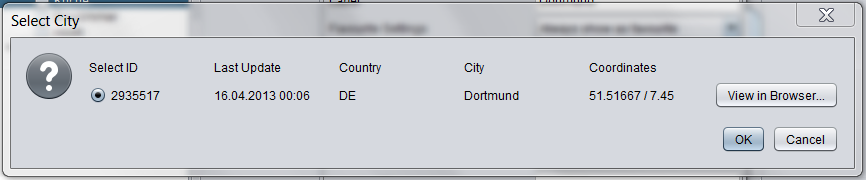
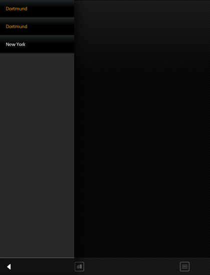
In spite of the enormous information and the comfortable display of data, the configuration of this control element only consists of two fields, which have to be filled in. There are: 1 These will be: 1. time zone (necessary for displaying the time of sunrise and sunset correctly) and 2. the name of the town, which weather data should be displayed. The town, whose weather data should be displayed. When these details are done, editor will search for the desired town. By the help of a hit list, desired town will be selected and confirmed. That`s all. Figure shows configuration of control element and figure below displays the hit list of searched town „Dortmund“.
Weather (Internet) in the phone presentation
The visualization in the phone presentation differs from the visualization in the tablet presentation on a number of points.
The figure on the right-hand side (weather (Internet)) shows the current time, the day of the week, the current temperature, the current wind speed, the rain probability and an icon displaying the current weather conditions (see figure on the right-hand side, marked yellow).
By clicking the symbol circled in orange, you can access the EEV phone presentation of the weather (Internet) control element (see figure "Weather (Internet) EEV")
By clicking the symbol circled in red, you can access a list in which all weather (Internet) diagrams are listed (see figure "List of all weather (Internet) control elements).
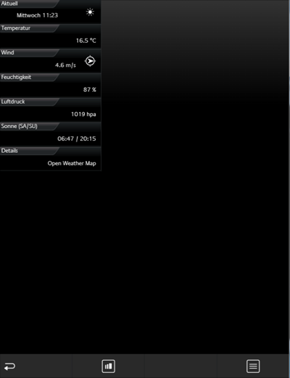
In the EEV phone presentation as well as in the tablet presentation, the current day including time, temperature, wind speed, humidity, atmospheric pressure and sunrise / sunset is displayed.
In the figure below, it is possible to choose between all weather (Internet) control elements in the room. Thus, tedious and unsystematic searching for different weather (internal) control elements is no longer necessary.
Values / Diagrams
-
Option: Operability? No
-
Extended view: Selectable
-
Height units: 2 - 8
Behind the control element “values and diagrams”, a lot of capabilities for visualization, comparing, sending and charting of values are situated. A function for trend and ranking completes the range of functions. For configuration, only a group address of the value has to be entered.
The control element has got one compact and one diagram view. The compact view is shown in ICP and ECP. At this place, only values are displayed (see figure). In EEV, one large diagram and further information additionally are situated. This extended view will be created by the editor, in case this option was activated before (see figure below).
Compact View
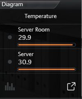
Following possibilities are situated in this view: (see figure right as well).
Trend function means, that in front of every value a symbol stands, that depicts, in which “direction” this value is in move within the hit list.
A triangle with the top up signifies, that the value has increased within the sequence (value is gone up). If the top points downwards, value has decreased within the sequence (value is gone down). A circle points out, that this value did not move within the sequence.
Ranking function has a bearing on sorting of values in the list. In case this function is activated, value will sort in decreased order, top down. The advantage is, that the biggest value always stands in the first place and doesn`t have to search in the list of values. If this function is disabled, values don`t change their order and will be displayed in the order, in which they was applied in the control element.
Option bar graph. This option extends every value with a bar graph. The bar of the highest value will be filled out totally, while the remaining bars will be filled out as a percentage (to the highest value). So, you can recognize at a glance, as far as values differ from each other.
Because the control element will be used as a value display also, it can send out values, too. This option can be activated for all values. In visualization, this option will be shown by a “notepad and pen“ symbol, which is always situated right beside the value. By a click on this symbol, within the value/diagram control element, a numeric field opens, by which value can be entered and transmitted conveniently
Extended (diagram) View
Here the functions and hints to the diagram.
To open the diagram, a click on the symbol in the lowest line of the control element (see figure above) will be enough. By the way, this line with the diagram symbol only will be displayed, if the diagram was activated for this control element.
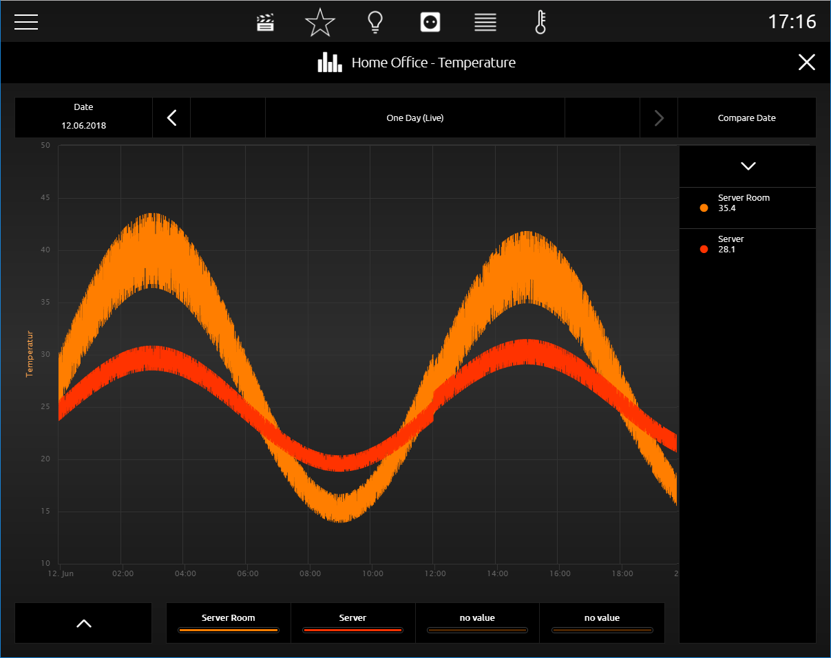
Value for diagram selecting Always if the diagram will be opened (see figure above), also the list of applied values will be displayed. Out of this list, the user selects these values, which should be shown in the diagram. This list is placed on the right of the diagram (see figure above). Selection takes place by a simple click on desired values. By a click on the header, the list will be folded in.
Selected values will be listed below the diagram. There also the assigned colour of the value will be shown (see figure above). In case, one of the selected values should be erased out of diagram again, this can happen by dragging out the selected value upwards out of the list (below diagram). While dragging out the value, a symbol of a trash barrel will appear.
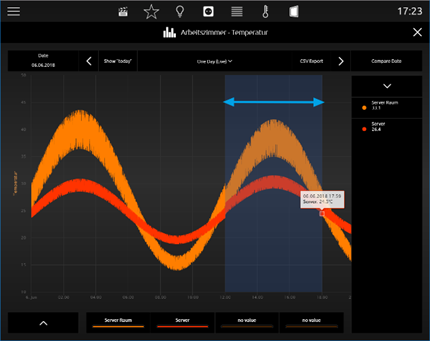
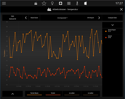
To read more precise values out of a diagram, it will be enough to move a finger over the desired graph. In this way a speech balloon opens, which will show the point of time, the identifier, the unit and the value. In figure below such a speech balloon is seen. Also possible is to tap the position in the graph; this option is more suitable for touch visualization clients. Graphs also allow zooming, which enables to scale for a detailed view. Zoom area simply will be drawn up by the mouse (with pushed button) or by a finger (horizontal movement). Figure below shows a blue arrow, which marks, how far the time range was drawn up. Figure below displays, how desired time range has been enlarged afterwards. By the button “Reset Zoom”, enlargement will be cancelled. This button only will be displayed in the center above diagram, if the time range was enlarged.
Time range modify. By the help of the two arrows above the diagram, you can page up (to the right) or page down (to the left) the displayed time range. The current date is shown on the left side above the diagram
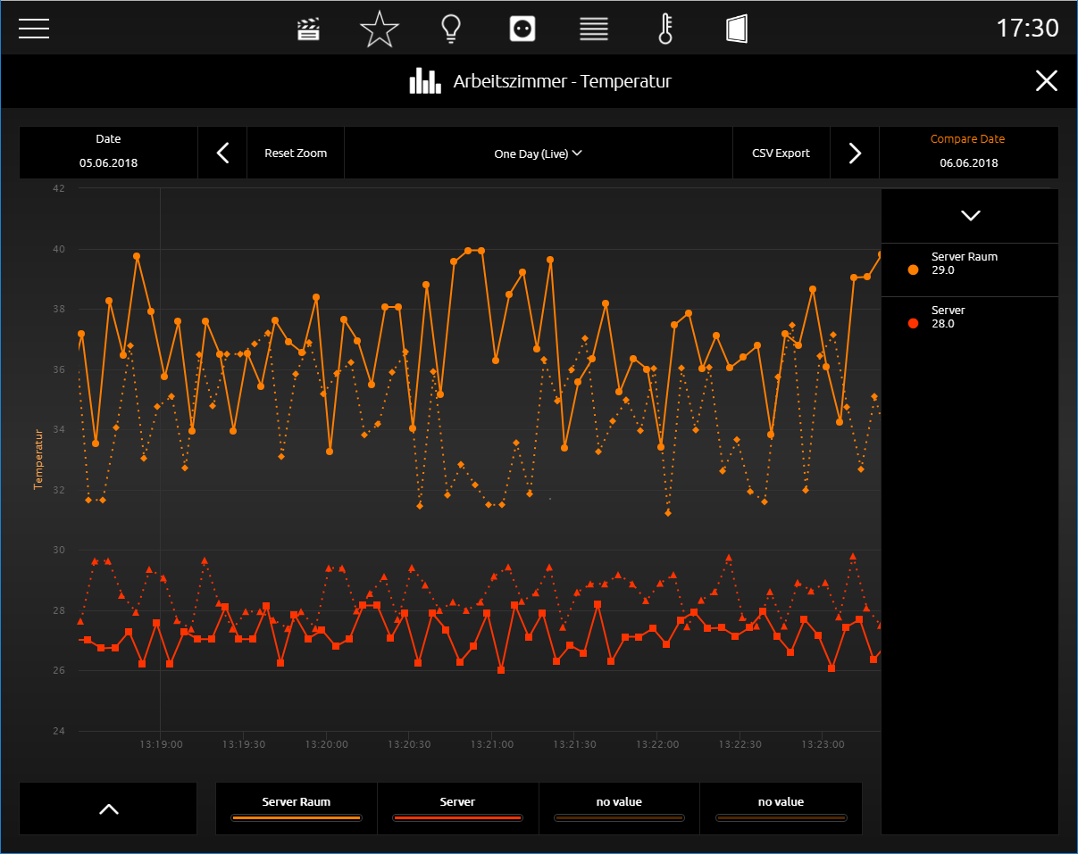
Value comparison. On the right side, above diagram, the freeze function (Date comparison) is located. This function makes possible to “freeze” the current pointed graph. These freeze graphs still will be shown, if now the time range will be modified. So, it is possible to make a comparison between the values out of different time ranges. In figure above temperatures from “server room” and “server” will be compared with temperatures of the previous day. Time ranges are displayed above the diagram, on the left (current date, that can be modified; solid graph) and on the right side (confirmed (reference) date; “freeze” graph will be pointed out in a spotted line)
Compare diagrams with different units.
Also, in the event that values with different units should be integrated in one diagram, diagram control element has a solution. In a further example (figure below), two values are compared with each other, which have got different units (temperature, power). In this case, diagram control element inserts a second y-axis with the second value`s unit. In example both axis is placed on the left side, but it is configurable, on which side the axis should be displayed.
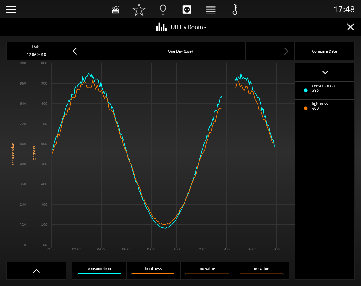
These units can be applied in the editor, configured and used again in other diagrams. This ensures that always the same unit, formatting and identifier will be displayed.
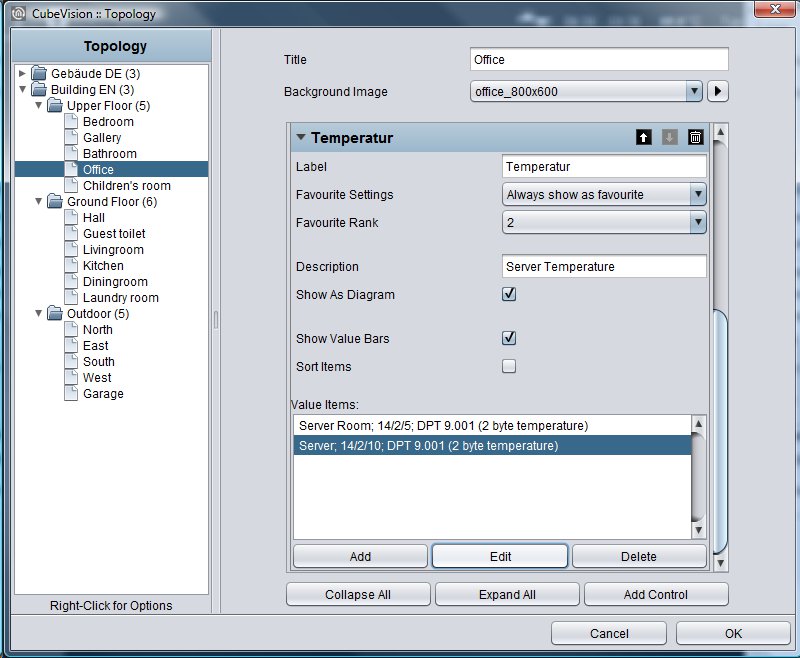
This control element has got following configuration fields (identifier see figure):
-
Description of values. This text will be used for the headline in visualization and in diagram.
-
To display as a diagram. This option activates the diagram of a control element. In doing so, an additional line will be inserted, by which the diagram can be opened. (see figure “element of values/diagrams”)
-
With bar graph. This option blends a bar graph below every value. The bar of the highest value will be filled out totally, while the remaining bars will be filled out as a percentage to the highest value. (see figure “element of values/diagrams”)
-
To sort values. Thereby, the function will be activated for sorting the values in a descending order top down. If this function is disabled, control element displays the values in that order, in which they were applied.
-
Values. In this field, applied values resp. group addresses will be listed, applied and arranged, which should be displayed. To do this, three buttons are located below the field.
-
Delete. For erasing marked group addresses resp. values off the list.
-
Modify. Opens configuration window of marked group address.
-
Append. Opens configuration window to append a new group address resp. value.
-
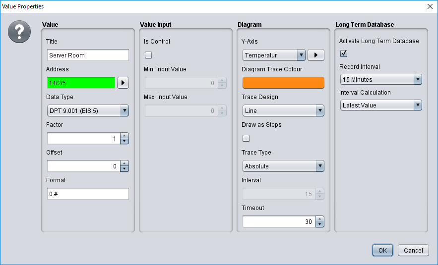
Figure “configuration window value” shows the configuration window, in case a new value was appended or modified (modify button). The options:
-
Name. This identifier will be shown in visualization control element above the value or in diagram above the colour.
-
Address. This is the group address of the value, which is displayed. Group address can be selected by ESF selection dialogue (button with a triangle, which points to the right). If option „data entry“ is enabled, control element also will send to this group address.
-
Data type. Data type which describes the value. Possible choices are: DTP1.001 (EIS1), DTP5.001 (EIS6), DTP5.010 (EIS14u), DTP6.010 (EIS14s), DTP7.001 (EIS10u), DTP8.001 (EIS10s), DTP9.001 (EIS5), DTP12.001 (EIS11u), DTP13.001 (EIS11s) and DTP14 (EIS9).
-
Factor. Received group address will be multiplied by this factor.
-
Offset: Offset value will be added to the received value, before it will be displayed in visualization. Hint for factor und offset: The result of this calculation will be used solely in visualization. Order of calculation: First, the factor will be calculated and afterwards the offset value will be added, before the result will be shown in visualization or in diagram.
-
Entering values: This option permits the user, to send values to this group address. Thereto a symbol will be blended beside the value, which opens a numeric field for entering desired value.
-
Input: min. / max. value. There to a value range with an upper or lower limit can be defined for entering values.
Y-axis und selection dialogue: Herewith the unit for the y-axis can be chosen. Units, which often will be used, can be „applied“, to avoid configuration of them for every control element again and again. Applied units will be listed in a pull-down menu and can be selected easily. In another configuration window (see figure below), which will be opened with the selection dialogue, units can be administrated. In this configuration window, units are configured centrally. Possibilities of configuration:
On the left, existing y-axis configurations are listed. By + and – button below this list, new configurations will be appended or deleted.
-
Name. This name will be displayed vertically combined with y-axis and in the tooltip
-
Unit. Unit will be displayed in brackets after the unit`s name.
-
Page. Defines, whether axis will be shown left or right of diagram.
-
Minimum/Maximum Limit. This option activates the min or max border of y-axis. In this way, a fixed scaling of y-axis will be achieved. If no limits were set, diagram control element scales automatically the y-axis.
-
Minimum/Maximum Value. These data represent the upper and lower border of y-axis.
-
Graphics Colour. The colour, which is selected here, will be used for the graph.
-
Draw as steps. Prevents the linear connection of successive telegram values. This way you get a more sensible representation as a square wave e.g. for EIS1 values.
-
Type of graph. The type of graph determines the method of data processing for the graph.
-
Absolute: The absolute value is pointed out. Generally, temperatures or other actual measured data.
-
Difference: The difference curve can be used to create day profiles of steadily increasing actual counts.
-
-
Interval. If for type of the graph the option difference will be selected, the interval time can be specified in minutes by this parameter, in which the difference to the last interval will be calculated. The larger the interval time, the more smoothed the graph will appear.
-
Trace timeout. Two successive values are only connected if the time interval between the values is smaller than this timeout.
This allows better detection of problems such as missing sensor values.
This means that you should set the value higher than the interval between two values that would be expected in a normal case.
If the timeout is set too low (e.g. 30 minutes if a sensor sends every hour), the graph will only consist of single values that will never be connected.
Long Term Database
Long-term recording is only available if the value/diagram element is active as a diagram element (see figure “Display as diagram”).
Active Long-Term Database
If the recording is deactivated, all previously recorded data of this value will be deleted. Please use the CSV export in the visualization to save already recorded data.
-
Record Interval. Here you can set the time at which interval a group address is recorded.
-
Interval Calculation. Here you can set the way in which the group address is recorded.
-
Latest Value. The last value is recorded at the set time.
-
Maximum Value. Only the maximum value is recorded.
-
Minimum Value. Only the minimum value is recorded.
-
Average. The average value is recorded.
-
Interpolated Value. The interpolated value is recorded.
-
Telegram Count. The number of telegrams is recorded.
The long-term recording always saves only the data in the selected interval calculation. If the type of interval calculation is changed, all previously recorded data of this value will be deleted. Please use the CSV export in the visualization to save already recorded data. Alternatively you can start another recording for the same value with different settings.
In the case of long-term recording for minimum value and maximum value, if a factor < 0 is used under "Value" for the interval calculation, it must be noted that the maximum value is set for recording the minimum value and the minimum value is set for recording the maximum value.
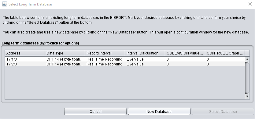
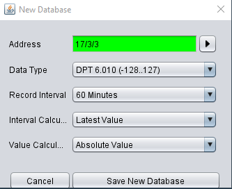
Create a new database:
-
Address
-
Data type
-
Record interval (live, 10 minutes, …, 24 hours)
-
Interval calculation (e.g. latest value, maximum or minimum value, average, etc.)
-
Value calculation (absolute value, difference value)
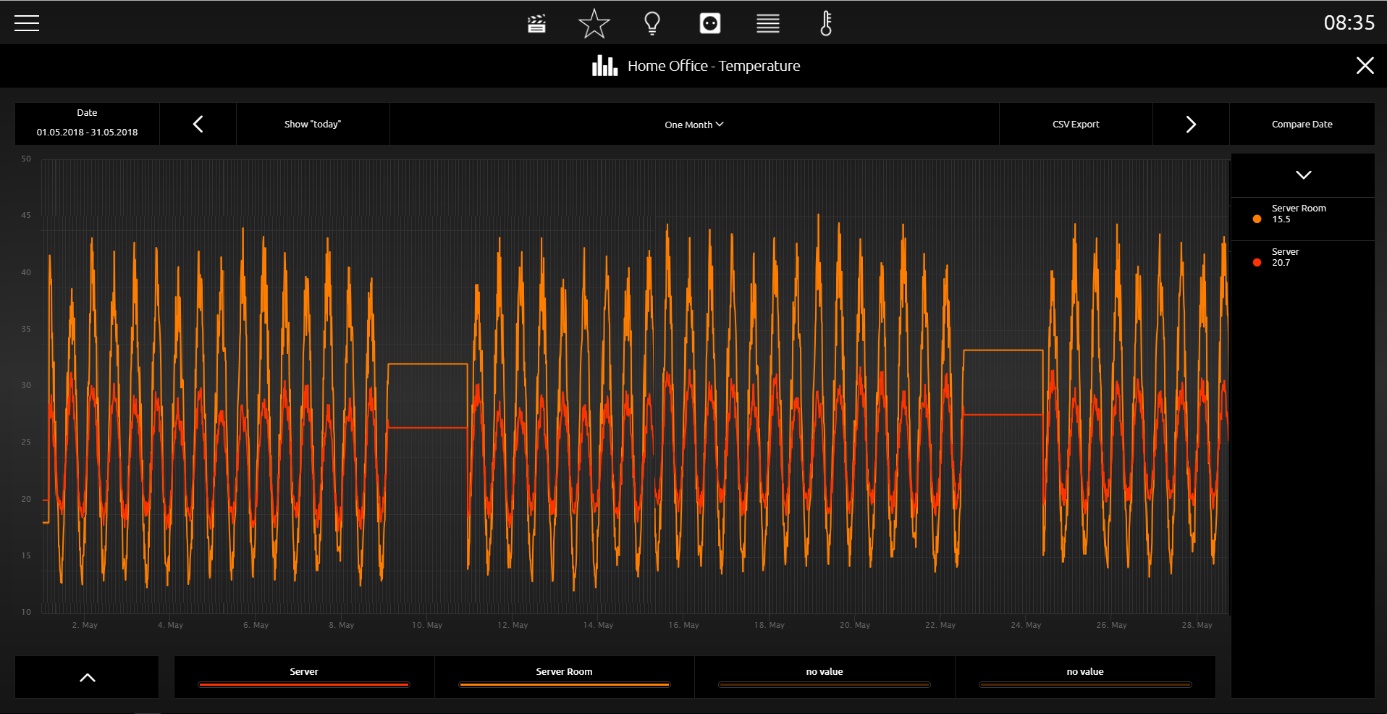
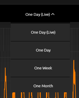
In the visualization, the view of the long-term recording can be selected between recording for 1 day, recording for 1 week or recording for 1 month.
Values / diagrams in the phone presentation
The visualization in the phone presentation differs from the visualization in the tablet presentation on a number of points.
By clicking the symbol circled in orange, you can access the EEV phone presentation of the "Value / Diagram" control element.
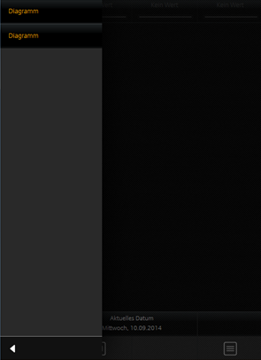
By clicking the symbol circled in red, you can access a list in which all diagrams are listed.
Clicking the symbol circled in green, you can return to the menu.
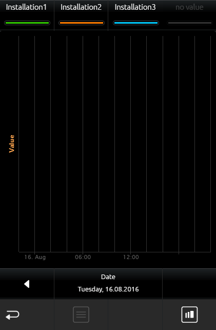
In the EEV phone presentation, further details about the respective diagrams can be found, just like in the tablet presentation.
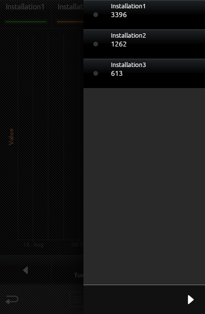
In the figure below, it is possible to choose between all diagram control elements in the room. Thus, tedious and unsystematic searching for different diagram control elements is no longer necessary.
Text Display
-
Option: Is it operable? No
-
Extended view: No
-
Height units: 1 per text input
This element is used to display EIS 15 (DPT 16) text strings in the CUBEVISION.
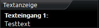
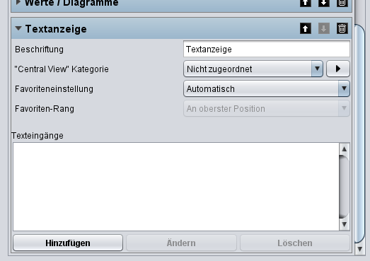
The element can display several text inputs. A text input is inserted via the "Add" button.
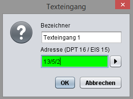
Group switch / Scenes
-
Option: Operability? No
-
Extended view: No
-
Height units: 1 und 2
Sense and purpose of this control element is, that a group of symbols, which contain different group addresses (four at a max), can be collected/placed in one control element. The function behind it (that`s the actual feature) but will show only one of the symbols as active. Independent from that is, whether the symbols carry the same group address or not.
In brief shows a group switch with two functions, at one point the gate and at another point the barrier. If now for every function a different group address will be used, it has to be assured, that always only this group address will be displayed as active, which was released at last. In a regular channel, such a function has to ensured lavishly, that always only one group address resp. symbol may be shown as active. In the scene control element, this function already is implemented.
Layout of the control element`s outline will be selectable freely. and display several layouts. In a height unit, it can be utilized four function inclusive symbols at a max, but without lettering. The other two layouts offer a display over two height units. On the one hand for two functions with symbol and a long lettering and on the other hand with four functions with symbols and a short lettering. For selection there are 30 several symbols available.
Beside the different group addresses, values and data types can be selected certainly.
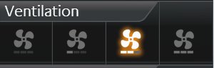
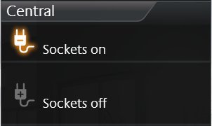
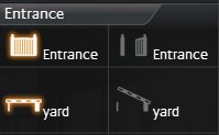
This control element has got following configuration fields (identifier see figure below):
-
Width for function. With it, the layout of the control element will be determined. For selection are available “Icons” (figure “Element group switch – only icons”), “icons and a short text” (see figure above) and “Icons and a long test” (figure above middle).
-
Highlight active. One option, whether the symbols in active state also will be highlighted.
-
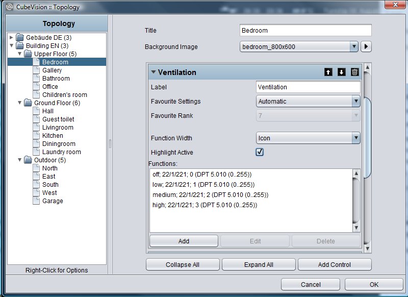
Functions. This window lists the group addresses for the functions. For administrating of group addresses, buttons „Append“, „Modify“ and „Delete“ are available below the list
-
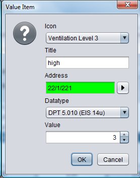
Configuration window functions. The Figure below shows the possibilities of configuration.
-
Icon. Here are situated over 30 different icons, for realizing an optical hint to a function.
-
Name. The name will be displayed with its icon, except the single-line layout, which only shows the icons.
-
Address. Group address, on which it will be transmitted, if this function is released.
-
Data type. Choice of data type (DTP 5.010 (EIS14u) and DTP 1.001 (EIS1)) of the value, which will be sent and received.
-
Value. The value, which should be sent to the group address, can be entered here.
-
Tuneable White
-
Option: Operability? No
-
Extended View: Yes
-
Height units: 2
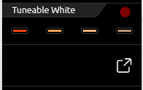
This Tuneable White visualization element is used to control lamps via the CUBEVISION, where it is possible to set the colour temperature from warm to cool white. In addition, four predefined colour temperatures and brightness value combinations are available as preselection that can be called up directly. Via the CUBEVISION visualization itself, it is also possible to mix up to four of these combinations and save them as favorites.
This control element has two views. A compact one with two height units, for the ICP or for the ECP and another one in the EEV. The compact view shows a maximum of four combinations in the first line (see illustration above right).
In addition, the current set colour temperature and brightness value combination is displayed in the upper right corner of the element as feedback.
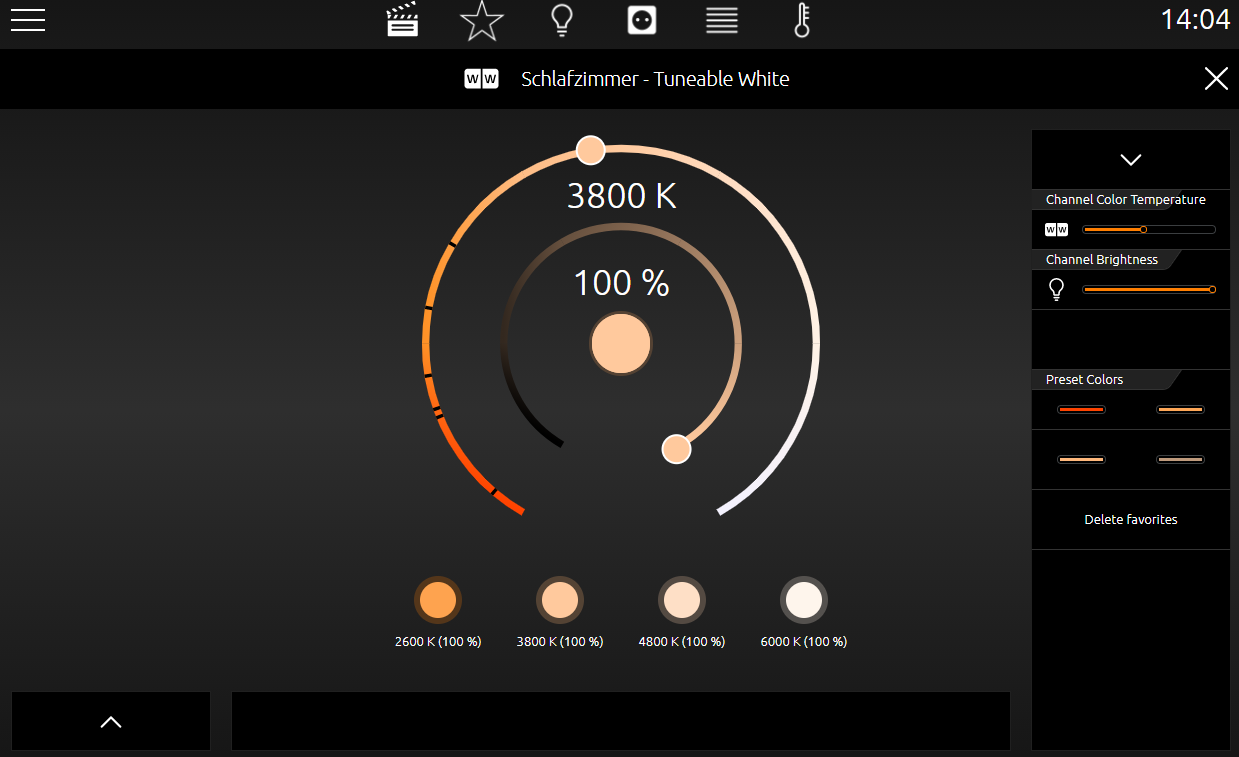
The second view shows the Tuneable White control element in the EEV further control options. In addition to the selection of preset colour temperatures and brightness values, the EEV also offers the user-selected favorite combinations for selection.
The illustration below shows the Tuneable White control element in the EEV view. In the right column there are two "sliders" with which the colour temperature and brightness value can be set.
In the center of this view there are two circles that can be used to comfortably select the colour temperature and brightness value with a tap of the finger. Directly below there is a line with 4 buttons each for the favorite combination. Below these buttons, the respective value for the colour temperature and brightness value is also displayed for each colour temperature and brightness value combination. In the middle of the two circles, the round area shows the currently set combination.
A currently set combination can be saved as a favorite simply by dragging and dropping it onto one of these buttons.
To send the colour values to a Tunable White lamp, enter the group address for all colour temperature and brightness values a separate group addresses. Here are the data types:
-
Colour temperature as 2byte value
-
Brightness as 1byte value
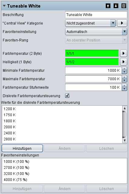
This control element has the following configuration (see illustration below):
-
Colour temperature (2 bytes). Communications object for controlling the colour temperature.
-
Brightness (1 byte). Communications object for controlling the brightness.
-
Minimum colour temperature. Determine which minimum value may be set via the visualization.
-
Maximum colour temperature. Determine which maximum value may be set via the visualization.
-
Colour temperature step width. The value set here defines the "step width" of the colour temperature when adjusted by the user. For example, you can define that the colour temperature can be changed in 100K steps by the user.
-
Discrete colour temperature control. Activates the discrete colour temperature control. In this mode, the value range of the colour temperature control is limited to up to 10 set values. The set colour temperature values are displayed as markers in the visualization.
-
Values for the discrete colour temperature control. The window is displayed if the option §Discrete colour temperature control§ is activated. Here you can define the colour temperature values that are jumped to directly during operation.
-
Favorite settings. Favorite settings for colour temperature (Kelvin) and brightness (percent). These settings are displayed as a separate button and can be activated with a click.
///