
Navigation
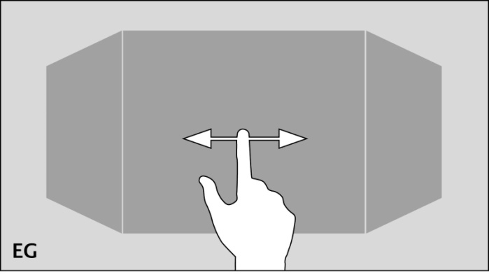
Navigation through the building structure takes place by horizontally and vertically sliding in the mode room view.
Room view:
By room view, this sight will be intended, which shows a room, more precisely the front surface of a cube. This surface will be used for navigation.
Navigation:
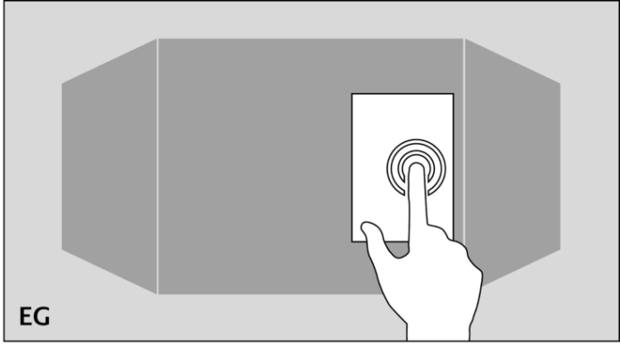
As it will be shown in the following two figures, shifting from room to room by a horizontal finger movement is possible. In horizontal direction exits no limits. This means, that after the last room the first room will be displayed again.
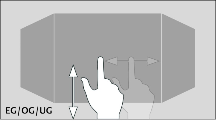
The vertical finger movement serves for navigation through levels resp. floors. If the end of vertical direction will be reached, an orange colored corona appears at the border below or at the top end, according to which direction the user`s moving takes place. This indicates the end of vertical direction.
One of the major advantage of CUBEVISION element is, that the user doesn`t have to be worry about navigation between rooms or levels. Working with changeover elements, how its known in classical visualization, is cancelled completely.
As well the testing of the navigation: if somewhere the user will be toddle into a deadlock, from which he can`t get back to the front page, because a changeover element is simply absent on this visualization page.
To reach a room directly and without detours (also in another level), quick navigation can be applied.
Quick navigation
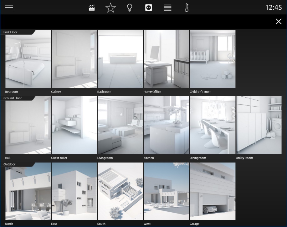
In the mode Quick Navigation, all rooms will be displayed at one side for faster navigation. In this way, user can switch directly to each and every room. The creation of an overview for all rooms takes place automatically.
Opening of Quick Navigation:
Quick Navigation can be started in two different forms.
-
Over the complete area of the room view
-
By an arrow, this will be displayed downright in the room view.
The option how to start Quick Navigation can be adjusted in the configuration window (see figure 5) of the CUBEVISION element (in visualization editor).
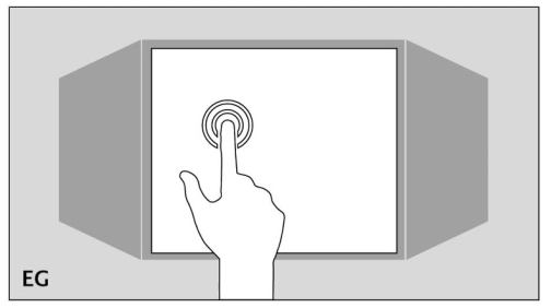
Closing Quick Navigation:
By the exit symbol in Quick Navigation, the overview can be closed, to shift back to the room view.
Quick Navigation can be disabled completely when necessary
Quick Floor Navigation
The Quick Floor Navigation is another type of navigation through the floors. Instead of pulling the cube in the "Tablet" view upwards or downwards to switch between floors, a navigation icon is displayed on the right-hand corner of the screen, via which you can select the floors directly.
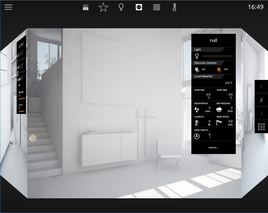
On mobile devices (smartphone, tablet), the Quick Floor Navigation optimizes the performance of the CUBEVISION, as less memory is required.
Configuration of the floor designation
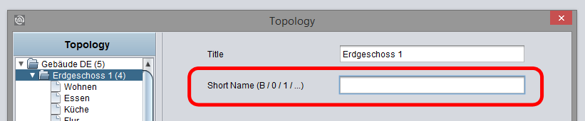
In order to change the display designations of the Quick Floor Navigation, the "Short Name" input field is available in the CUBEVISION Editor when clicking on the respective floor. Here, a maximum of two (2) digits can be assigned to each floor. If no entry is made, the floors are numbered consecutively from top to bottom.
Instant Control Panel [ICP]
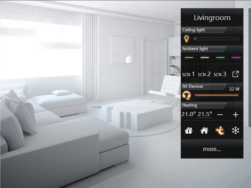
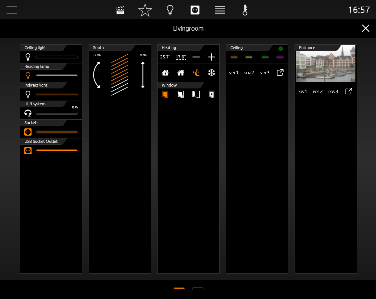
Every room has an Instant Control Panel (shortened ICP), which always will be located on the right side. In the first place of Instant Control Panel, the name of the room appears. The position of Instant Control Panel can`t be changed (see figure below).
Instant Control Panel provides space for max. 8 elements of visualization (the elements have a height from 1 to 8 units)
If there is not enough space in the Instant Control panel:
If for visualization elements of the room more than 8 height units will be required, the elements, which doesn`t fit into the Instant Control Panel, will be displayed in the Extended Control Panel (see next chapter).
It automatically appears a “more” – button below the Instant Control Panel, by which the Extended Control panel can be activated. (see figure 9)
Instant Control Panel and favorite function:
Instant Control Panel has a particular function, which allows to arrange elements in order of their importance.
This means, that the most often used elements in one room can be displayed in the room view and therefore they could be operated directly.
The favorite function controls, how often the user will utilize particular elements and so it sorts the order of the elements on this basis in Instant Control Panel. This means in effect for example, that if in winter time Christmas illumination in the garden will be controlled often, this element will also be displayed in Instant Control Panel.
No configuration is necessary. Solely these elements have to be marked, which should be observed as favorite elements. This will be described more precisely in chapter “elements.”
To position visualization elements manually in Instant Control Panel
As desired, even so elements of the room can be positioned manually. Therefore, the favourite function will be disabled and a place in the order in Instant Control Panel will be given to the element.
Extended Control Panel [ECP]
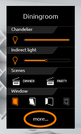
All elements, which are used in a room, will be displayed in the Extended Control Panel (shortened ECP). So, all elements of the Instant Control Panel, too. The creation takes place automatically.
Extended Control Panel:
-
In this view 4 columns are displayed always at least.
-
Every column has 8 height units.
-
If 4 columns doesn`t be enough, a page can be added when necessary.
-
By column break, elements can be arranged in the columns thematically.
Opening and closing of Extended Control Panel:
Extended Control Panel will be opened by the button “more…”. This button will be displayed only on demand. By the exit-symbol (arrow at lower left, see figure) this view can be closed.
Extended Element View [EEV]
Extended Element View (shortened EEV) offers another view of elements, in which more information (as cover, diagram, large pictures of cameras, …) can be outlined.
Extended Element View has got 5 elements (State firmware 3.2.0)
-
RGB Control
-
Camera
-
Multimedia
-
Weather (Internet)
-
Values / diagrams
In visualization, the access to Extended Element view is illustrated by a rectangle, from which one arrow points upwards to the right. It is located inside the element on the bottom right (see figure below).
Example:
This extended element view is generated fully automatically. The extended element view of the Internet Weather Symbol is shown in the figure above and marked by an orange circle.
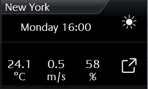
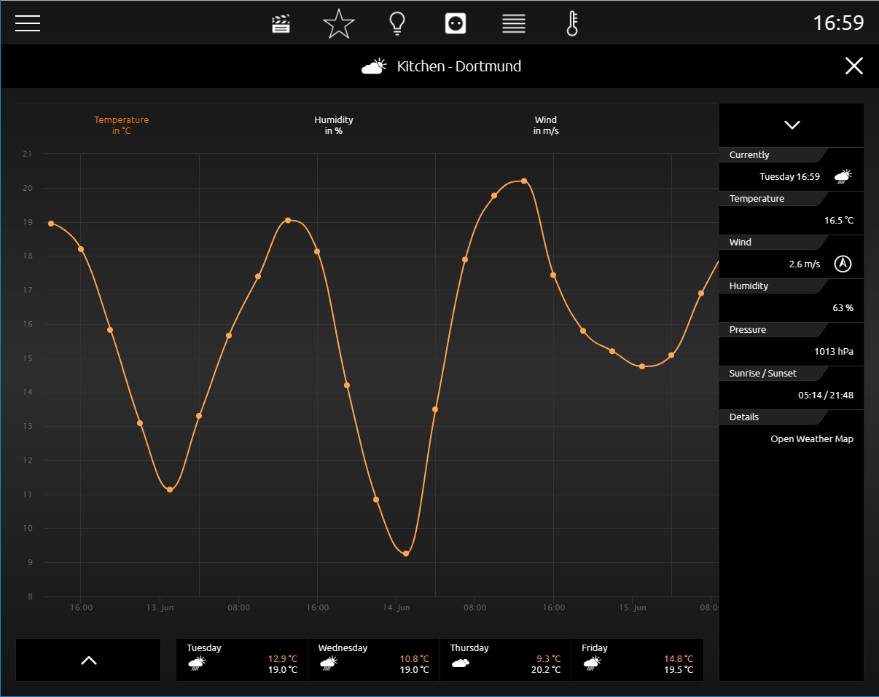
A click on the symbol on the bottom right will open the extended view (Extended Element View). This extended view of internet weather will be shown in the figure below marked by an orange circle...
If in a room several similar elements will be inserted with extended view:
In our example, two internet weather elements have been inserted in the kitchen. The first shows the local weather (Dortmund) and the other displays the weather of New York. CubeVision Extended Element View integrates both in a list on the left side (see figure). In this way, the user can switch between both elements back and forth.
Central View
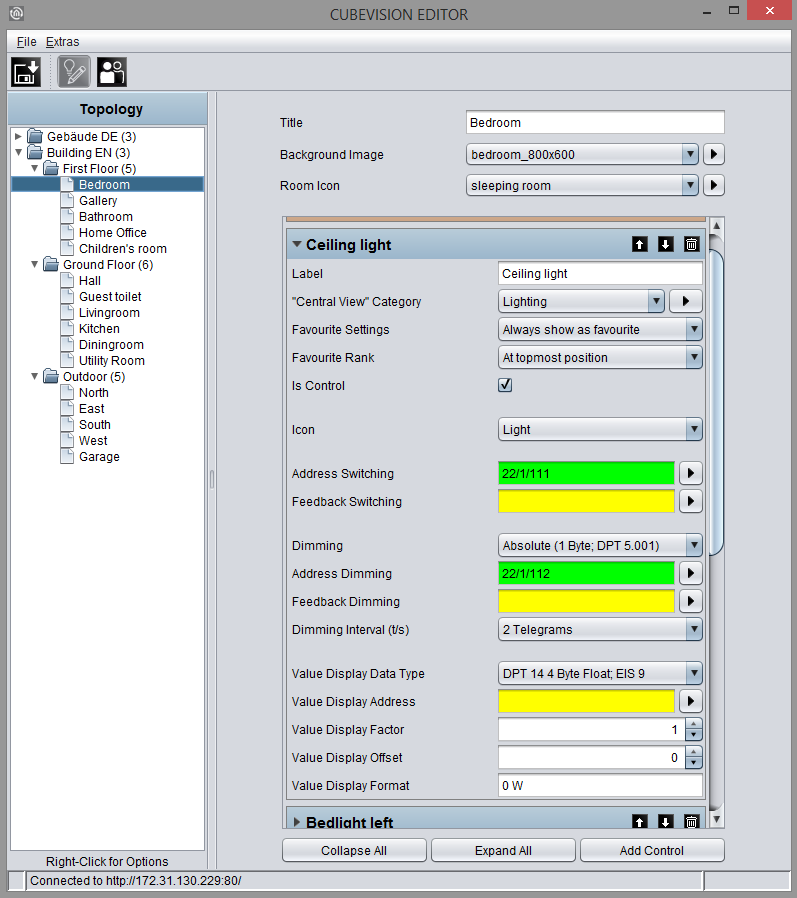
"Central View" is an additional function allows a room-independent central overview of the required functions. Each visualization element includes the "Central View" menu item and can thus be assigned the required central view.
Here, it is possible to add categories to the "Central View" menu according to your own wishes and requirements.
To do this, please proceed as described below:
-
Click the

-
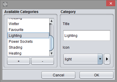
A new window opens up, in which you can now create new categories.
-
Operations (see figure below, "Add category"):
|
Symbol |
Functions |
|
"+" |
By clicking "+", a category can be added. |
|
"-" |
By clicking "-", a category can be removed. |
|
Title |
Here, the category can be assigned a title. |
|
Icon |
Here, you select a specific icon for the category. |
|
|
Click this symbol to add an individual picture for the icon. |
|
Cancel |
By clicking "Cancel", you cancel the adding process. |
|
OK |
By clicking "OK", a new category is saved. |

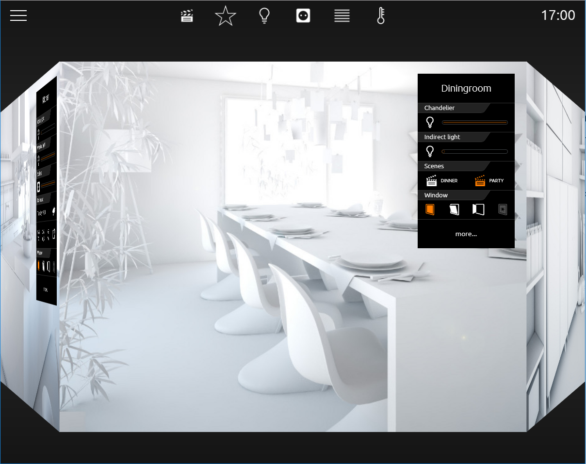
As soon as the control element has been assigned a required "Central View" category, the corresponding menu item is generated in a status line above CUBEVISION in the tablet presentation.
In this way, it is possible to generate any group of control elements in the "Central View" menu.
///