The Slider element serves for adjusting several data types infinitely variable. Additionally, the element’s style can be changed in many ways. The graphics also can be replaced.
CONTROL L Unterstützung
Dieses Element kann auch für CONTROL L genutzt werden.
Specific parameters
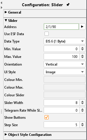
Address
The KNX group address to which the slider sends its current value is entered here.
Data type
The functionality mostly applied to the slider is absolute dimmer for lighting. So, the data type used are EIS 5 and EIS 6.
Use ESF Data
Check this box if you want to see in the visualization of the identifier used by the group address from the ETS as a tooltip.
Min. / Max. value
These two parameters margin the adjustable values. Usually, the dimmer function uses the range from 0- 100%; so, these two values are set as default.
Orientation
Select here orientation vertical or horizontal.
UI Style
The appearance of the element can be changed at various points. There seems to be whether you are a member by the visualisation editor's features a distinctive look, or if you load using the theme editor other graphics, or both.
The alignment can be horizontally or vertically. Moreover, it can be selected between graphic style (picture) and drawing style (drawn). Changing the icons of an element they will only take place in case of UI style “Image” is chosen.
Telegram Rate While Slide
The slider sends the setting of "0" is always only one value when the motion comes to be. The element should also send values, while it is in motion, here the number of frames per second is determined that the slider during the adjustment sent.
Show Buttons
If this option is enabled, "+" and "-" buttons for incremental adjustment are shown in addition to the slider.
Step Size
This feature is active if the option "Display buttons" (see above) is enabled. It can be used to define the increment size for button operation.
Object style configuration
All other options are described in chapter General Element Parameter.