Projects and pages
The structure of one visualisation project will be assembled roughly by so called “projects” and „pages“. At this place particular parameters will be described, which will be determined by projects and pages. Many of parameters carries global characters, which specify generally performance and appearance.
Projects
In parameter window of a project, general project settings are determined. This window will appear when you choose your requested project out of the project structure.
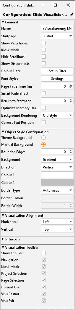
General
Name: Name of your project.
Start page: Starting the visualisation project, the selected page will be displayed.
Show page index: An index of pages will be displayed on the margin of visualisation, in case of activated entry. With the help of this index, you can call up directly your visualisation pages.
Kiosk-mode: In this entry activated, visualisation starts in full-screen mode. This mode will be used especially in case visualisation is not allowed to be closed. (Official hours)
Show disconnects: The activated entry here displays connection problems between client and EIBPORT (red bar at the bottom of the visualisation window)
Colour filter: Using this filter, you can change colour of element diagrams. The background of the elements will not be influenced in this way. Preview shows the appearance of the icons (in actuated and not actuated status). You can select between three defaults colour filters.
Page fade time (ms): You can configure a “page change change-over” mode. This parameter specifies duration of change using the measure of milliseconds.
Smart fade effect: The change-over effect will be performed more gently. Possibly effects of flicker will be avoided hereby. Furthermore change–over appears softly, if you are using slow acting computers.
To start page: After the specified number of minutes without any user interaction to visualize changes from any page in the project back to the defined home page.
Please note: During the fade process, no switching is possible.
Optimize memory usage: Using this option, only elements of the actual visualisation sheet are called up. This implicates a minor consumption of memory, but time for loading will be extended a little.
Background presentation: This option changes the rendering characteristics in Java CONTROL and CONTROL L:
Compatibility: In this setting, the presentation might differ between Java CONTROL and CONTROL L but it is compatible to older browsers.
Precise: This setting shows pixel precise backgrounds. It can, however, cause problems in older browsers. All modern browsers should function correctly with this presentation.
Adjust text position: If this option is enabled, the text position in CONTROL L is adjusted to match the presentation in the Editor. Otherwise, the different rendering mechanisms may cause the presentation to differ.
Object style configuration
These settings define the style of the elements used within the project; the settings obtain for the whole project. Each element an individual style can be assigned to via Element Attributes:
Theme background: The Theme background is set within the Theme Editor and can optionally be set to global. So, the style will be uniform for the whole project.
Manually: Select this option in case of manual definition of the object “background”.
Rounded edges: here the radius of the edges can be set (unit = px)
Background: Three different options are available for the elements:
“Gradient”, “Background Colour” and “No Background”.Alignment: If “Gradient” is selected as background it can be defined here if the direction is vertically or horizontally. If another kind of background is selected this array is greyed out
Colour 1 and Colour 2: Here the two colours for the gradient can be defined. If another kind of background is selected this array is greyed out
Frame Style: Each element background has a frame; here can be defined if the frame is set “automatically”, as a “line” or “invisible”.
Frame Colour + Width: If frame style “Line” is selected the colour and width (unit = px) can be set here. These settings can be changed individually for every element (Parameters for elements).
Please note: These settings can be changed individually for every element (Parameters for elements).
Visualisation alignment
With the help of this setting, the visualisation surface will be adjusted in your Visu-window.
Visualisation ToolBar
Using a hook in certain control box, you can define, which of the Visu ToolBar menus will be popped up in visualisation, respectively the generally appearance of ToolBar.
Intercom
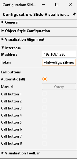
With this menu there is possibility to integrate an INTERCOM system into the visualization. The required data, interface and protocol are adapted by the INTERCOMMODULE and are available for the visualization. The configuration is transferred from the INTERCOMMODULE to the visualization by using a TOKEN.
Call buttons
Call buttons, assigned to the INTERCOM system, can be connected automatically (all) or manually after an update via the inquiry button. With that the setup of an INTERCOM connection is completed. When receive a call the communication is established then a window opens automatically.
Master pages
For most projects, the basic properties of a page, repeat again and again. This need not be readjusted at each project site, these parameters it is possible to use this so-called Master Pages. It is also possible that pre-set properties in the options parameter to ignore the pages individually.
The master page affords following settings:
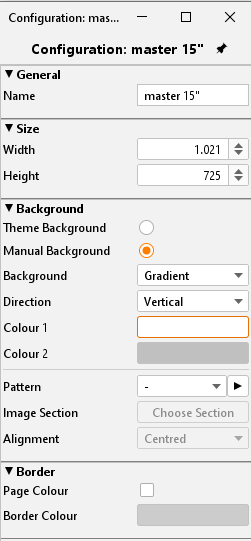
Size
The master page specifies the size of normal pages. This setting, you can`t ignore by the configuration of pages and this setting will be always effective by using master pages.
Background
To determine the appearance of backgrounds, you can choose between following possibilities:
Theme Background: If this option is set the background will be displayed as set in “Theme”. This serves for a central matching of icons and pages.
Manually: Using this menu item the style and colour of the background may be set individually by the user.
Background: Select the background style here. There are two alternatives available:
“Gradient” and “Background Colour”
Alignment: If background style “Gradient” is selected the direction can be set here.
Colour 1 + Colour 2: If “Gradient” is selected both arrays are activated else just one
Pattern: You can also define a general picture for placing to the background. With the help of the arrow symbol near the menu for selection, a dialogue for transferring images will open.
Orientation: Here you can determine the orientation of your background picture.
These settings you can ignore in parameters of normal pages.
Frame
The frame of a defined visualisation surface can be illustrated in terms of colour for a coherent appearance in all screen resolutions. The frame assumes the colour of the site, or it will apply colours, you have chosen before. The frame can be defined from the master page.
Flip / dialogue pages
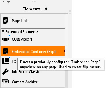
The flip / dialog page is an extra page element that makes it possible to define smaller pages that can then be pulled to an existing visualization page (requires at least 2 segments). In addition, these sites can also appear as dialog elements in the foreground. In this manner, the operation of a visualization can be greatly simplified.
Following settings can be adjusted for the page:
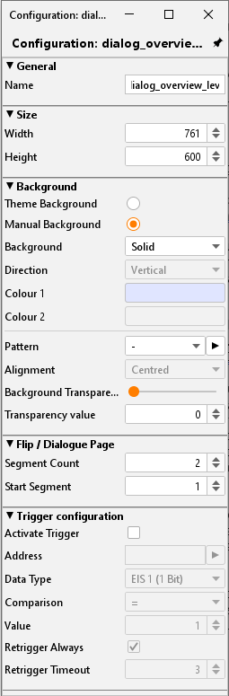
Generally
Name: Please define one unique name, so that the page can identified definitely in further course.
Size
Here you can define height and width in unit “pixel”. In case, the page should be used for flipping, it will be better to utilise a lower resolution. The higher the resolution the more computing power for visualisation service must make available by the client.
Background
It could be adjusted several background configurations.
Theme Background: If this option is set the background will be displayed as set in “Theme “. This serves for a central matching of icons and pages.
Manually: Using this menu item the style and colour of the background may be set individually by the user.
Background: Select the background style here. There are two alternatives available:
“Gradient” and “Background Colour”Alignment: If background style “Gradient” is selected the direction can be set here.
Colour 1 + Colour 2: If “Gradient” is selected both arrays are activated else just one
Pattern: Instead of a colour, you can select a background picture out of the image files. Image files are displayed with their labels in a drop-down menu. If the picture is smaller than visualisation surface itself, you can determine by the help of orientation, whether the picture should be stretched, or in which place it has to be positioned. Furthermore, transparency of background picture can be adjusted by one slide control or by a number field.
Embedded page / dialogue
Please determine from here, on how many elements page should be consisted, or which element should represent your start page. Start page is especially essential for configuration as a “flip page”. We number continuously from left to right. Maximum 10 Embedded Page Segments are possible.
Event configuration
This page can be displayed due to an event in EIB. In this case this page is used as a dialogue page and it causes one warning on your screen, for example. Apart from all kinds of data types, the element supports diverse comparison operations. Furthermore, you can determine, if the element will always react, or only after one value modification and how many times must pass by, so that element will react again of one input value.
Using of flip/dialogue pages
To use one page as a flip element, it must consider of several elements, so that you can flip at all. If you want to use the element rather as a dialogue page, for fault messages for example, it will do, to define only one page.
Flip page: Please specify in “number of pages” more than one page and choose accordingly one start page. On your working surface, pages will appear side by side, from left to right. One flip/dialogue page can consist of several individual pages (or individual elements, too) whereas height and width always determine only the size of the single page. On the flip page, you can place and configurate all desired elements and backgrounds, like you do on every other page, to place one flip element in a visualisation page, the element “embedded page (flip)” will be used. For this purpose, please check corresponding element.
Dialogue page: In case you activate the event configuration of flip/dialogue pages, you will get one project overlapping dialogue, which will superimpose every visualisation page, based on the adjusted KNX/EIB event. Visualisation itself fade into the background and will be „greyed out“.
Pages
Every project consists of one or multiple pages. If one page is marked in the project structure, all parameters of this page appear in the right window.
Generally
Name: Every page should have been named clearly.
Master Page: You can use previously created master pages as a template for your chosen page, with the help of this drop-down menu. In this case, the master page specifies size, background and the frame settings of your page. To enable different adjustments, you could ignore background and frame settings with a control box.
Size
Width: Wideness in pixel
Height: Altitude in pixel
Hint: Please consider when specificate width and height that later a taskbar and the visualisation frame cwould be. added to the whole screen
Background
Several background options can be used:
Ignore master: The background setting of the master page is not used for the page.
Theme background: When creating a theme in the Theme Editor, a background colour can be defined to globally match the appearance of the icons. The Theme Editor is an additional programme and is described in a separate document.
Manual: In this setting, you can determine the type and colour of the background yourself.
Background: Select the type of background here. You can choose between ‘Colour gradient’ and ‘Background colour’.
Orientation: If the ‘Colour gradient’ background type is selected, the direction of the gradient can be selected here.
Colour 1 + Colour 2: These fields are used to determine the corresponding colour. Depending on which background type is selected, only one or both colour fields are activated.
Pattern: As a background pattern, one picture out of the uploaded picture pool will be displayed. With the aid of the arrow button, dialogue “Uploading images” opens. In addition to that, you can specify the alignment.
Frame
A frame makes sure, that the VISU-surface will be displayed all over your screen, no matter how, which resolution is adjusted. In case, that among the visualisation-clients one screen offers a higher resolution as the visualisation surface, the frame will be shown additionally. The colour of your frame can be set individually beside the colour of the page. The frame can also be determined by the master page.
Security
Each page can be locked with a PIN-code. The menu, which allows you to create and organize the PIN-code, has been opened with the help from the symbol right beside of PIN selection array. You can create a new PIN with the “+” – symbol. Your PIN-code should get a unique name. As a PIN, numerals from 0 to 9 in a random length can be chosen. The setting of decline for a PIN-code decides how long the user can work without a recent password request. In case the user remains working on the page and the PIN-code loses validity, a new code entry will be required, not until user opens the page again. By using the “-“symbol, a PIN-code will be erased. Options for PIN-code features, you can also change in the menu item “user settings”.
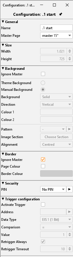
Trigger Configuration
Activate trigger: The regarding page will be displayed on screen by releasing a telegram. Reversal of a page can only take place within one project.
Address: Here the group address for event releasing must be filled in. Possible variations of EIS-types are EIS 1, EIS 5, EIS 6, EIS 9, EIS 10, EIS 11, EIS 14.
Comparison: Incoming group addresses can be proofed by comparison. Only a correct proof result will cause a change of page. Possible operation of comparison is similar, less than, greater than, less or equal, greater or equal and dissimilar. If the setting is “*” a comparison will not take place, the page will be initiate after any value of receipt.
Retrigger always: If this function has been activated, every accurate result of comparison starts a change of page, in case of non-activated function the change of page happens only after alteration of comparison results.
Retrigger timeout: The setting of time in seconds during a new release will not cause a reaction.
CONTROL L support
In what form visualisation elements and global parameters also are effective for CONTROL L, we can find out quickly and simply by means of tooltips. Visualisation elements will get one optical marking (a blue bar). CONTROL L support of the elements will be constantly developed and alters from firmware to firmware.
Colour coding:
Blue bar = Full CONTROL L support
Orange bars = No Java support
No bars = Only supports Java