Graph V2

Like the Graph visualisation element, this visualisation element displays the value progression in a diagram and differs in its range of functions. In addition to the live data (ring buffer), the long-term database available in EIBPORT for up to four group addresses can also be selected as the data source.
In the CONTROL L visualisation, Graph V2 also offers the visualisation user the option of comparing recorded data from different time ranges (freeze function) or exporting the current view as an image.
For the diagram view, the visualisation user can choose between a bar chart or line chart display. In addition to the graphical representation, the values can also be displayed in a table in the visualisation.
CONTROL L only!
This element is only available in the CONTROL L.
Specific parameters
Configuration parameters Graph V2:
Grid lines colour and axes colour
Selection of the colour for the grid and axes.
Axis Format
This text field is used to influence the number format of the y-axis. It defines how many digits may be before and after the decimal point. The following syntax applies:
A ‘0 ’ stands for a forced number; the position is displayed even if there is no value.
A ‘# ’ stands for an optional number; the digit is only displayed if a value is also present. However, more digits than specified are never displayed.
A ‘.’ stands for a comma.
If, for example, a percentage sign is to be inserted, this must be placed after the digit in inverted commas (').
Example:
The number ‘21.2 ’ should be displayed. If the number format is set to ‘00.00 ’, ‘21.20 ’ is displayed. If the number format is specified as ‘0.## ’, ‘21.2 ’ is displayed. A percentage sign with: ‘0.##’%‘’ is inserted.
Use ESF Data
Tick this checkbox if you want to see the identifier of the group address from the ETS used as a tooltip in the visualisation.
Lead time / follow up time
Select a time that is slightly greater than the distance between two telegrams on this group address.
This ensures that the telegrams immediately outside the displayed time range are also known and that the line of the graph at the edges of the time range is displayed correctly.
If the time range of your graph regularly begins with a gap before the first telegram value, then the lead/lag time has been selected too small.
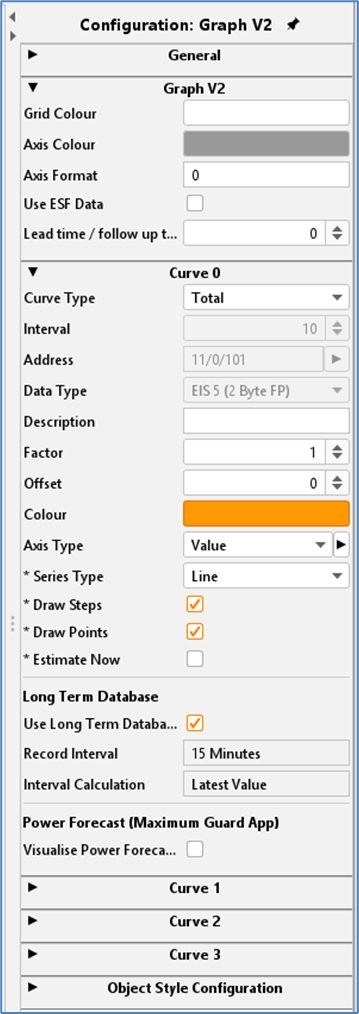
Graph V2 - Parameter
Curve configuration parameters:
Curve Type
A distinction is made between two types of calculation:
Total: The value is shown as an absolute value over time. In the case of a meter reading measurement, the graph would increase continuously.
Difference: The difference between two consecutive values of an object is displayed over time. The frequency of the difference measurements can be set in minutes using the ‘Interval’ setting. The smaller the time interval, the more accurate the curve.
Interval (in minutes)
This option is only available if the ‘Difference’ calculation type is selected. The interval specifies the time range (in minutes) in which the difference is calculated. The difference is calculated from the first and last value within this time range.
Data Type
The following EIS formats are supported:
EIS 1 (1 Bit)
EIS 5 (2 Byte FP)
EIS 6 (1 Byte)
EIS 9 (4 Byte FP)
EIS 10s (2 Byte Value)
EIS 10u (2 Byte unsigned Value)
EIS 11s (4 Byte Value)
EIS 11u (4 Byte unsigned Value)
EIS 14s (1 Byte Value)
EIS 14u (1 Byte unsigned Value)
DPT 29 (8 Byte signed Value)
The appendix provides an overview of EIS types in connection with DTP data types.
Description
Enter a legend for the curve here. The text is displayed below the graph in the selected curve colour.
Factor / Offset
The input value can be formatted as required using factors and offsets. The value is multiplied by the factor and added to the offset (negative offset is permitted). The factor and offset only affect the display in the visualisation and not the telegram value on the KNX bus.
Colour
Determines the colour of the curve and the title.
Axis Type
Various axis types can be defined and reused within the current visualisation project. Axis types are added or deleted using the plus and minus symbols (see illustration).
The parameters are:
Name. Identifier for the axis type.
Unit. The unit is displayed after the axis labelling and in the tooltip for the corresponding value.
Page. This selection defines on which side of the diagram the axis is placed.
Minimum/maximum - limit/value. To obtain a fixed scaling of the diagram, fixed limits for maxima and minima can be activated and selected. The diagram then only scales within these limits so that the curves displayed retain the scale of the Y-axis.
If no limits are activated, the diagram scales automatically.
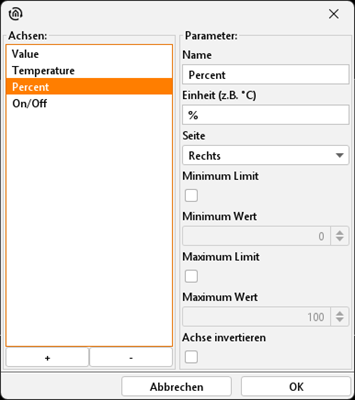
Graph V2 - Axis Type
Series Type
The curve type determines which diagram form is displayed. The following is available for selection:
Line: A line diagram is drawn
Area: An area diagram is generated in which the area below the line is coloured.
Bar: This type visualises values as vertical lines in the diagram.
Draw Steps
Prevents the (direct) linear connection of consecutive telegram values. This option generates a more meaningful display as a rectangular curve for EIS1 values.
Draw Points
If this option is activated, the received telegrams are marked with a dot on the graph.
This option also activates the tooltip for this graph. This means that the telegram value including time stamp can be called up for all points in the visualisation.
Estimate Now (Only available if ‘Draw steps’ option is activated)
This option extends the line of the graph after the last telegram. In the current time period, the line is extended up to the current point in time, in past time periods up to the end of the respective time period.
This option therefore ‘hides’ any lead/lag times that may have been selected that are too short, at least at the end of the time range.
If the time range of your graph regularly begins with a gap before the first telegram value even after activating this option, then the lead/lag time is too short.
Long Term Database / Use Long Term Database
Activating the recording opens the dialogue for the long-term database. After selecting or creating a new database (as described in chapter 5.2.1.3. EXTRAS / Long term databases), the data is transferred to the configuration menu. This data is then available in the graph element of the display. Depending on the visualisation, whether within JAVA or as a WEB view, as with CONTROL L, the selection of the display is different.
Object style configuration
All other options are described in chapter General Element Parameter.
Functionality within the CONTROL L - Visualisation
The difference to the ‘Graph’ element is that this visualisation element offers more functions (example in the CONTROL L visualisation, see screen shot below).
Current time range
On the left-hand side, in the header area of the diagram, the time range that can be seen in the diagram is always indicated.
Navigation
Use the ‘<’ (back) and ‘>’ (forwards) symbols to change the time range. For the live data (ring buffer), the time range is fixed for one day. To display the data from the long-term database, the visualisation user can switch between the time ranges day, week and month.
Selection of time range
In the drop-down list (also in the header of the diagram), the visualisation user can switch between the live data and the data from the long-term database.
The drop-down list is opened via the ‘v’ symbol. This symbol is only active if a long-term database is linked for this element.
(There are 5 icons on the right-hand side below the header in the diagram visualisation element, which can be used to call up further functions. See screenshot on next page) Here is the description of the functions from left to right)
Freeze
The first icon activates the freeze function. This enables the currently displayed graphs to be ‘frozen’. All frozen graphs are still displayed as dashed lines, even if the time range is changed.
This makes it possible to compare the values from different time ranges.
Data view
The second icon opens a table with all telegram values that are displayed in the diagram.
Switch to line diagram
A display as a line diagram is called up via the third icon.
Switch to bar chart
The fourth icon is used to display the data in the bar chart.
Save as image
The fifth icon saves the current view as an image file.
(additional function) Display current values
As soon as the time range is changed, an additional icon always appears in the first position, which is used to call up the current time range again.
(additional function) CSV export
This function is only available for the long-term database. When switching to the long-term database, a corresponding icon also appears automatically.
When activating the export, the desired graph and the time period for the export can be selected in the dialogue.
Using the ‘Zoom function’
If the mouse pointer is positioned over the graph element, the time range can be changed using the mouse wheel, e.g. from 24 hours to one hour for a more precise display of the individual values. The time range can also be moved forwards or backwards by holding down the mouse button.
With touch operation, the time range can be adjusted with two fingers (pinch-to-zoom), while shifting is done with one finger.
Calling up the ‘Curve information’
If you move the mouse pointer along the graph, information (in the form of a tooltip) is displayed for the respective measuring point. This includes the name, time stamp and telegram value (see the following screen shot).
This display is activated by the ‘Draw points’ option.
Function of the ‘Legend’
The legend is located at the bottom of the diagram. The colour of the graph is also shown here together with the name. Clicking on these entries hides the graph in the diagram (see screenshot below; ‘Temperature 4’ is deactivated).
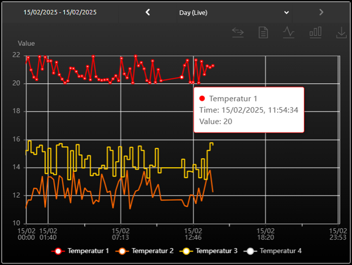
GRAPH V2 - Ansicht in der CONTROL L Visualisierung