Elements
All elements of standard library belong to visualisation elements and all the switches that were created by the COMPONENTBUILDER. These are, however, optional. For placing the elements on visualisation, it will be sufficient to click on these elements. Then they will be placed in the centre of visualisation page, focussed by a frame and on the left-hand side a corresponding element parameter will be displayed.
Themes / exchangeable elements
Visualisation-, operation-, job-, and CONTROL S -elements can be exchanged since firmware 0.10.1. Therefore, so called themes will be used, which contain a complete set of elements. You can edit these themes or particular elements with additional software, the “theme editor”, which is described in a separate manual, stored on website http://www.bab-tec.de .
General Element Parameter
Every element has specific parameters, according to its function. You can see them if you mark an object on the visualisation surface. Beside the specific parameters there are attributes, which are similar for all elements.
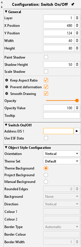
General
Layer:
Indicates on which layer elements will be located. Each element has its own layer. Using the input field, you can modify the layer of element. In this way elements could manage more simply, for example by placing them one above the other.
Position:
The position of one element in the space of the visualisation surface will be determined by entry of pixels, input per keyboard or arrow keys
Width/ Height:
Values of width and height can be changed by keyboard or arrow keys. The option “Keep aspect ratio” will not be regarded in this case.
Paint shadow:
You can dedicate a shadow to each element. In doing so, element will be reflected to the bottom in a defined value.
Shadow height:
The height of the shadow can be determined from 0 to 150 %.
Scale shadow:
In case this option is activated, the complete element is drawn in shadows, independent from the shadow value. By deactivating this option, the element will be displayed as well as the value of shadow was specified.
Visualisation editor - General elements Parameters
Global settings of the scaling behaviour
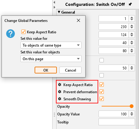
Set global element behaviour
Keep aspect ratio:
In case this option is activated, aspect ratio will not be changed, when you are extending or reducing element with your mouse.
By pressing the “Strg-key”, you can fix the aspect ratio, if you will extend your element and by pressing the “Shift-key”, you can fix the centre of your element.
Prevent deformation:
Graphics of elements will not be distorted by freely scaling, only the background of elements will be changed.
Smooth drawing:
Edges of elements will be displayed “softer”.
Using the rack-wheel symbol in front of the according lettering the three settings can be set to “global”. There are three ways for carrying out:
Set value for:
Objects of the same type. For all alike elements the parameter is set.
All objects: The parameter is valid for all elements.
All objects and as standard value: The parameter is valid for all existing elements and is set as standard for each new/ additional object.
Set value for objects:
On actual page: The settings are valid for all objects just on the actual page but not in the whole project.
In the project: The settings are valid for all objects within the project.
Opacity:
Using this function, element will be made stepless visible or invisible. Thereby you can enter some value as a number, or you can adjust it with a regulator.
Tooltip:
You can enter a tooltip for better identification. This tooltip appears in visualisation when your mouse will meet corresponding object.
Address allocation
In the event no address was entered, the data array will be displayed yellow, in case of a valid address; data field will be marked green. If your address has an incorrect syntax, data field will appear in red.
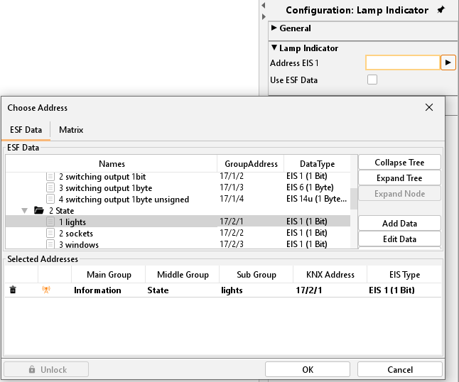
By entering addresses, spacebar can be used for „/“-key (Slash). That will simplify entering.
Address allocation with ESF-file:
With the help from the arrow keys beside the address entry field, the dialogue for administration of ESF-files will come up. In the area below 5 data arrays for addresses are located; in which elements can be equipped. It will suffice to make a double click on an address in overview, to fill in these data fields.
Using ESF-files:
By this option, the label of group address from ESF-file will be used for an element tooltip in visualisation.
Please note. In order that the label will be assumed, you have to set a hook und after that you have to choose the group address.
Object style configuration
The background appearance of an element is changed. The global style configuration for the selected element will be overwritten within the project parameters.
Theme Set:
When changing the elements in the theme editor, the graphic element different rates, so-called 'sets' are associated. The kits allow for example the Instead, a lamp is an electrical outlet. For a separate description of the Theme Editor, please refer to the supplied CD or the download section of our web site (www.bab-tec.de).
Theme Background:
At creation of a theme within the Theme editor a background colour can be defined to align the icons globally. The Theme editor works as an additional tool and is described in a separate document.
Manually:
If this option is activated the background of the object can be set manually in the arrays below.
Rounded edges:
Here the radius of the edges can be set (unit = px)
Background:
Defines the type of background. There are "background colour", "No background" and "gradient" is available.
Alignment:
If selected as a background style of the gradient here is its orientation can be determined.
colour 1 + colour 2:
"gradient" or "background colour", the colours can be determined.
Frame Type:
It is determined the appearance of the background frame. There are "no frames", "Automatic" or "line" is available.
Frame Colour + Width:
If frame style “Line” is selected the colour and width (unit = px) can be set here.
Modify font style
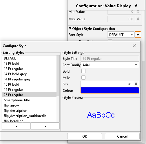
Change Font Style:
Some elements include fonts. In this case, you can alter additionally font styles in a ConfigTool. It is possible to apply various patterns of style, which you can use again and again.
Create a style:
By using the “+” key, you can lay out a new typeface.
Style features:
Here you can do necessary font style settings
Style preview:
Here you can see a preview of chosen font style.
Delete a style:
A font style could be erased by the key „-“.
Ignore font style:
If desired the font style for this element can be ignored. Then the standard font style is used,
Font colour:
If the font style is ignored, it is possible to enter a colour for the default font here.
Auto Scaling:
Is this flag activated the font size is automatically adjusted in relation to the element size.
Please note. If you change font style of an element, all elements with this style will assume those modifications, the font style „DEFAULT“, too.